Category:Food
Material:Paper-Metal-PE Plastic-Glass-Wood
Client:Baisicheng Food Co., Ltd.
Material:Paper-Metal-PE Plastic-Glass-Wood
Client:Baisicheng Food Co., Ltd.
Project Background:
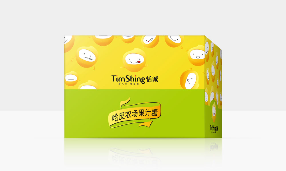
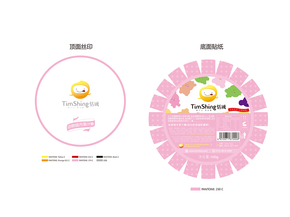
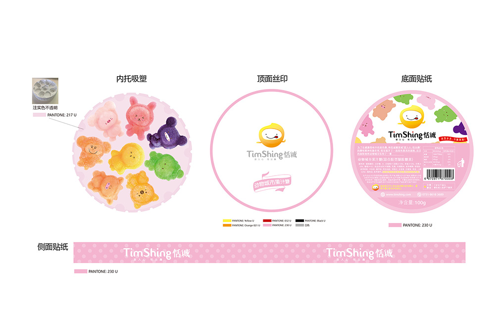
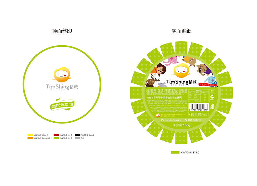
Tiancheng Candy, which has advanced production workshops and production technology in the industry, has always been adhering to the brand concept of "making candy with sincerity" in production and operation, and has been well received and appreciated by consumers. Once its cartoon candy was launched, it had a lot of loyal purchasing groups in a short period of time. In this cooperation, Tiancheng hopes that our team can design a new brand planning and visual image to further open up the market for young consumers. Target consumer groups are new people in society. They love socializing and sharing. They pursue fashion and trends, like to try new things, and are willing to spend money to buy interesting products for themselves and their children. So when facing snacks, their needs are no longer just good taste. "Fun and good-looking, shareable on social software, and able to reflect personal color" have also become their considerations. Compared with blindly promoting how delicious it is, young consumers are increasingly favoring fun promotions such as "trick or treat if you don't give me candy".
Solution:
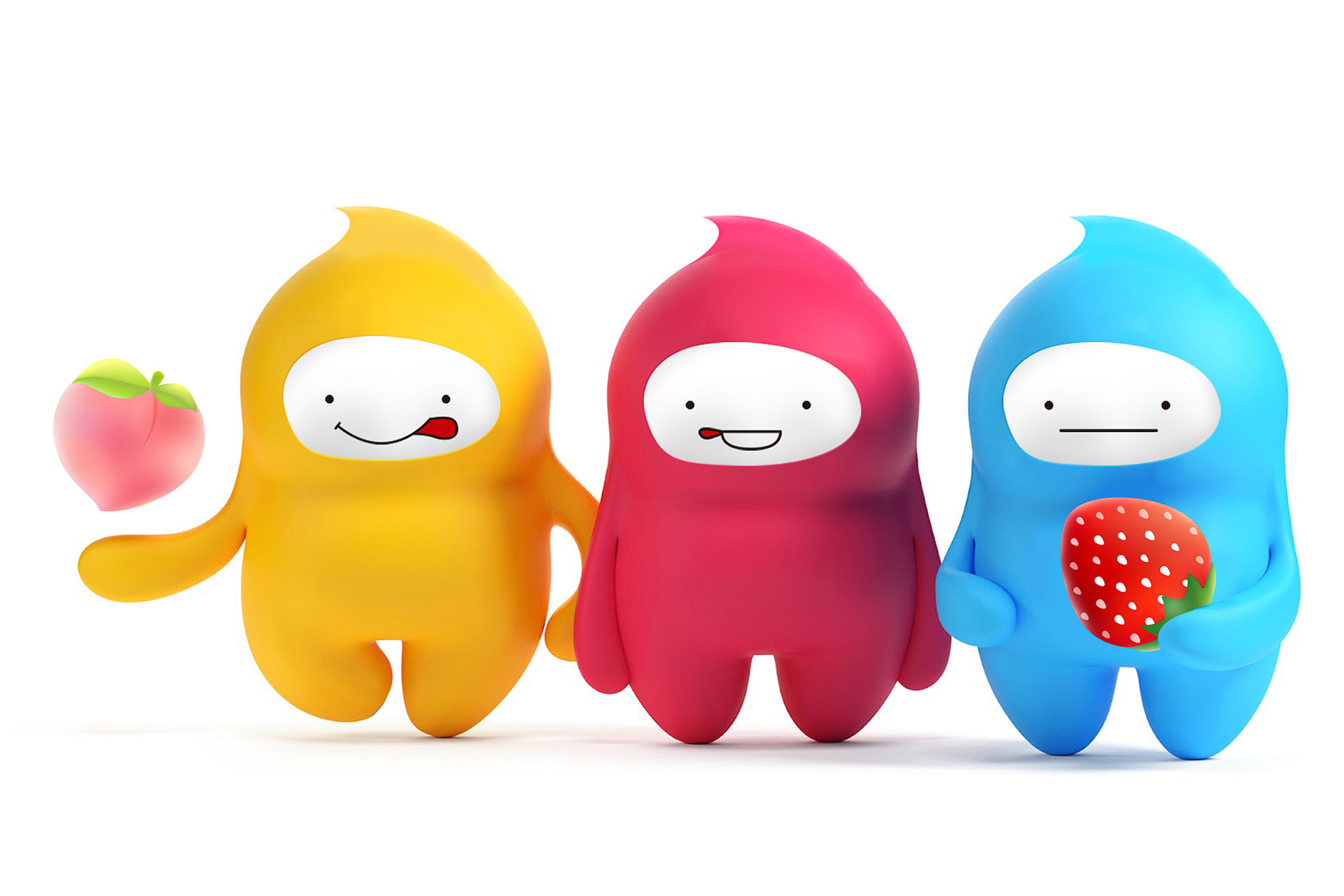
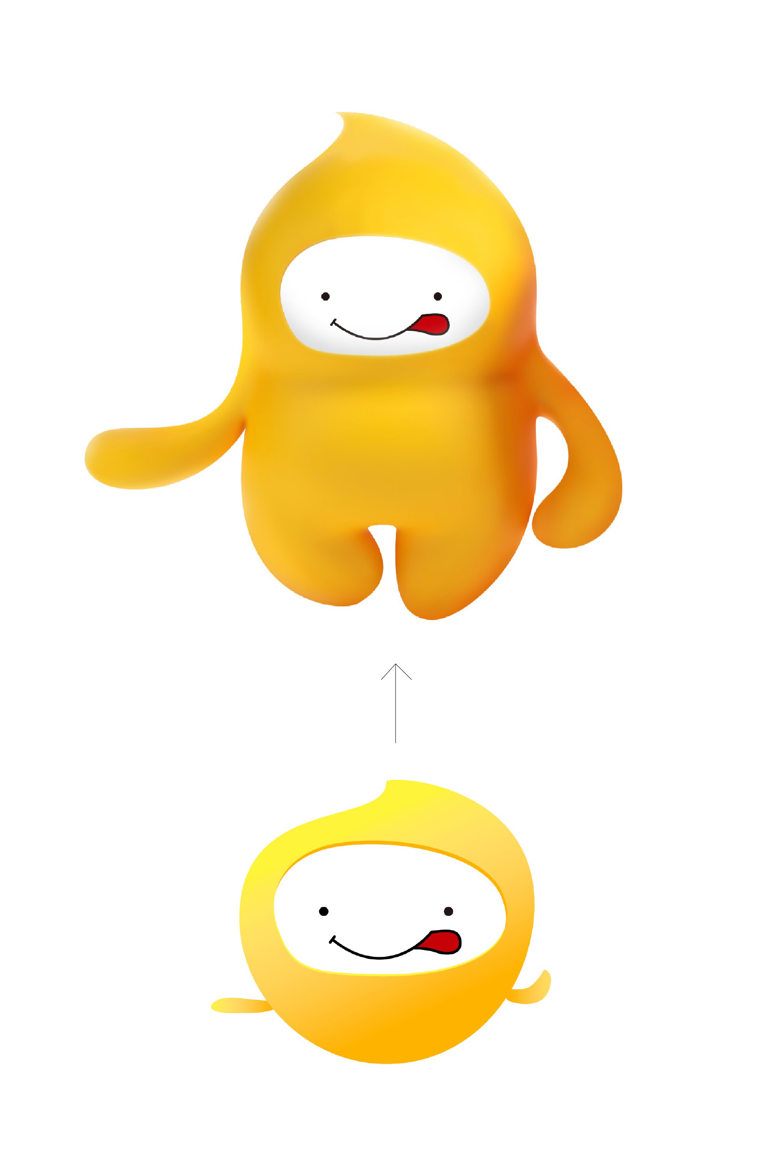
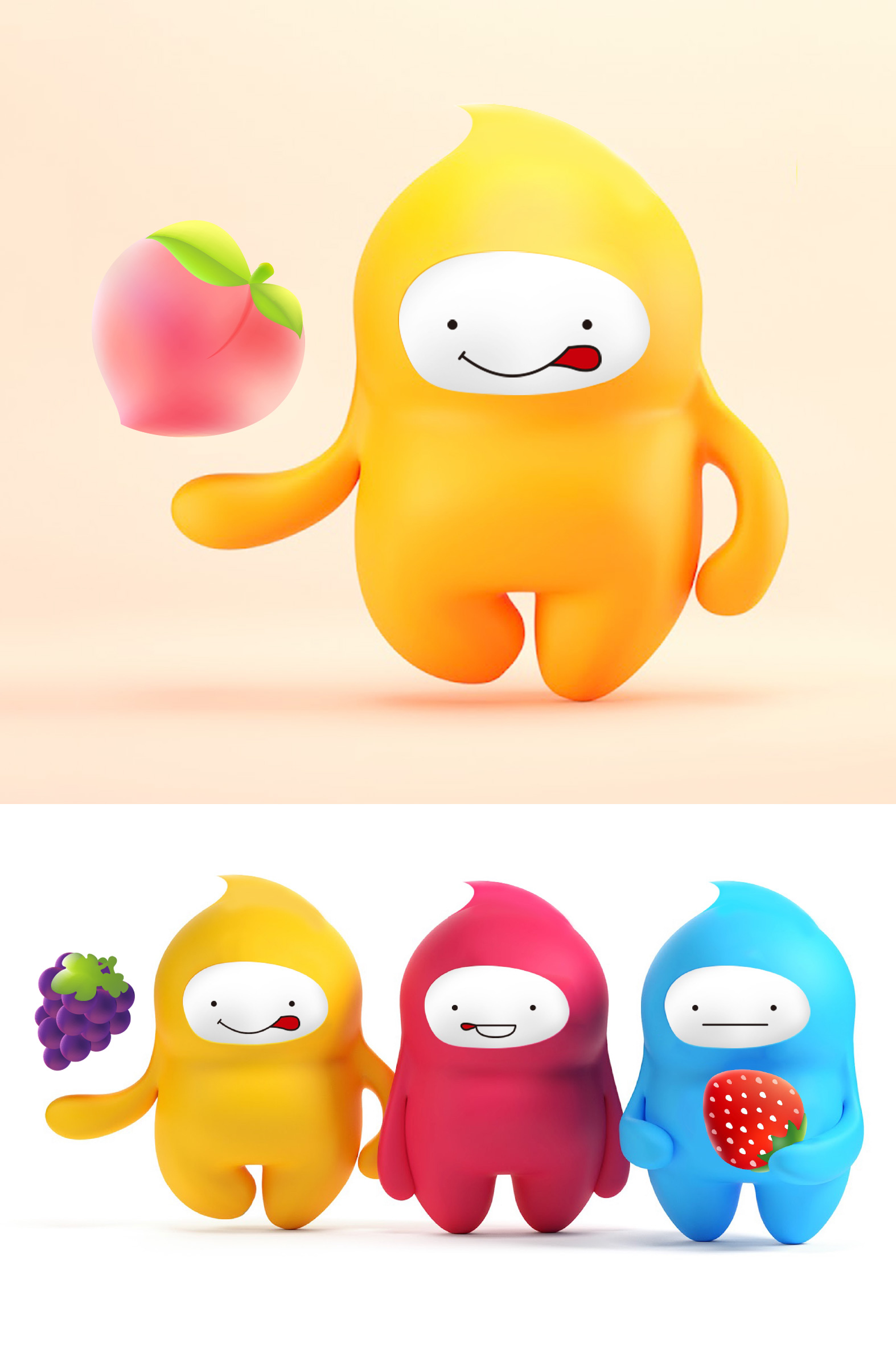
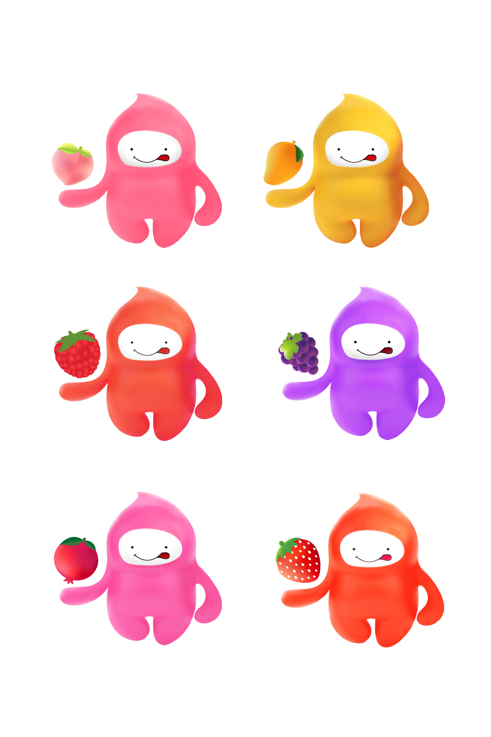
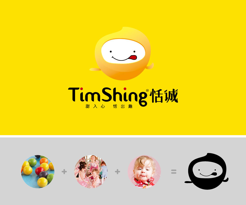
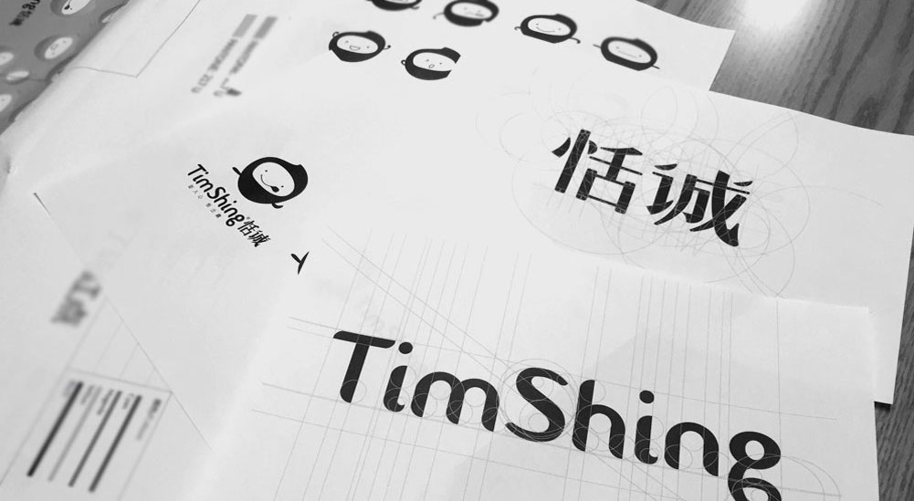
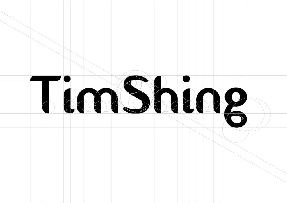
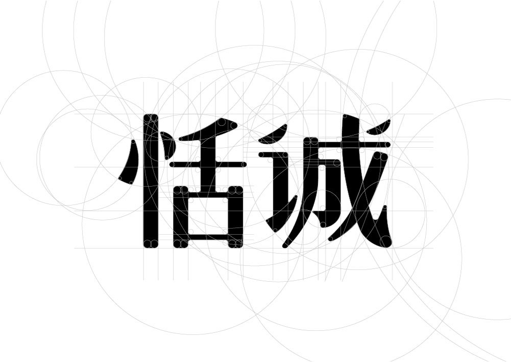
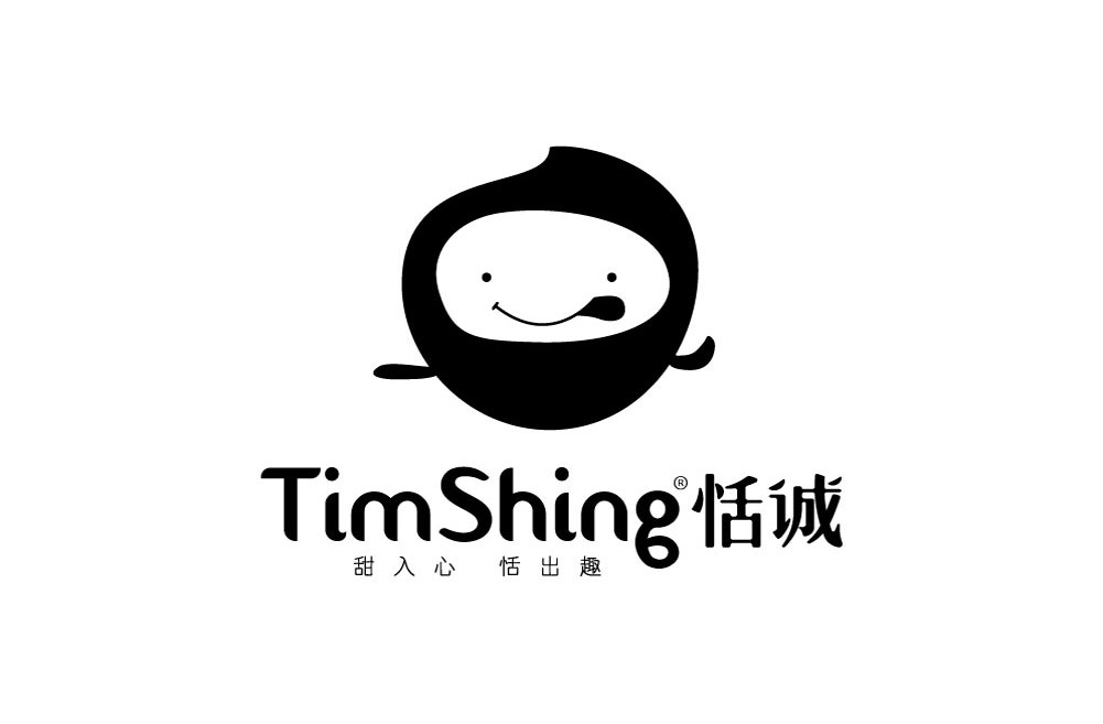
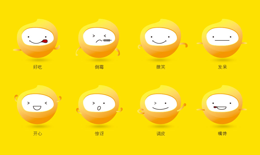
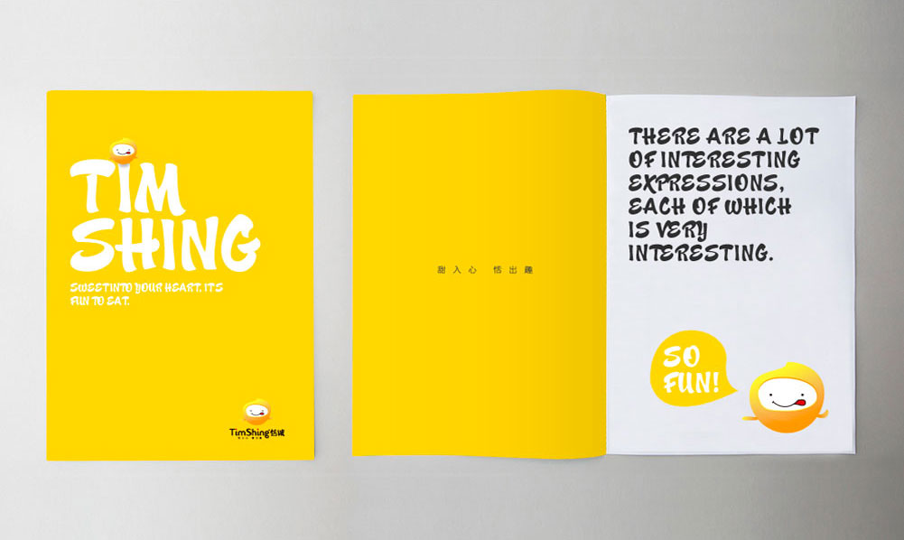
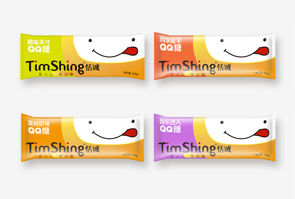
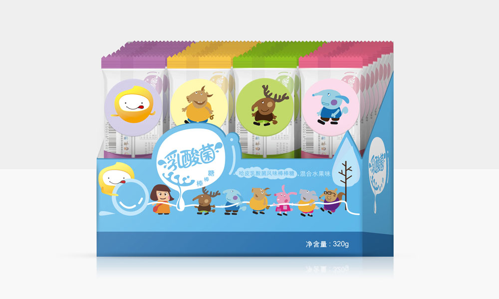
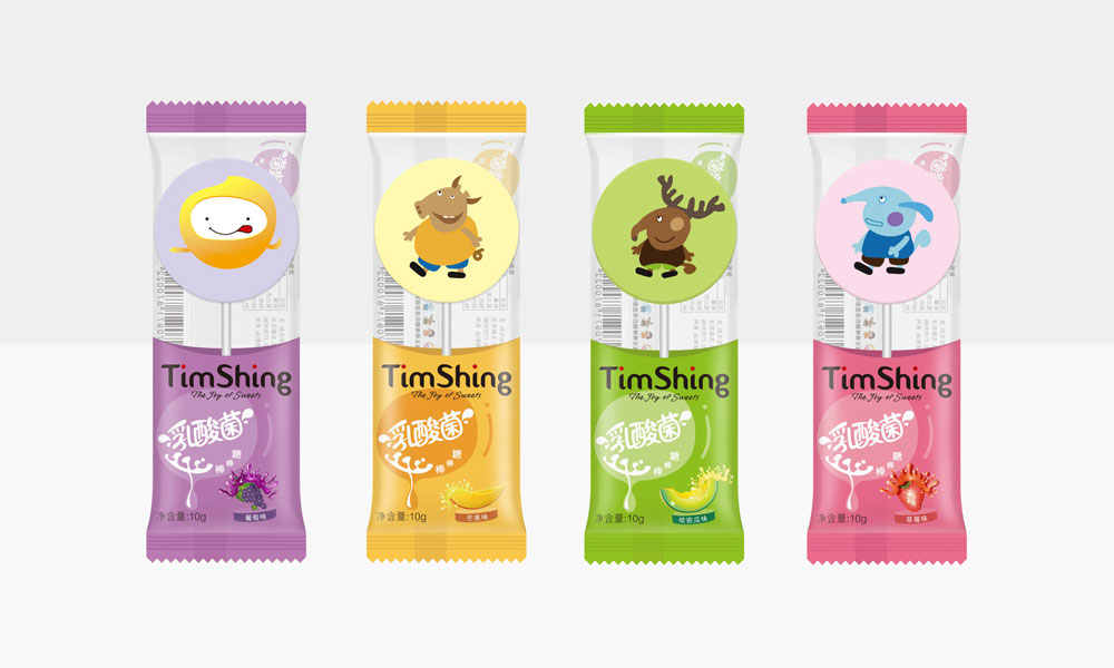
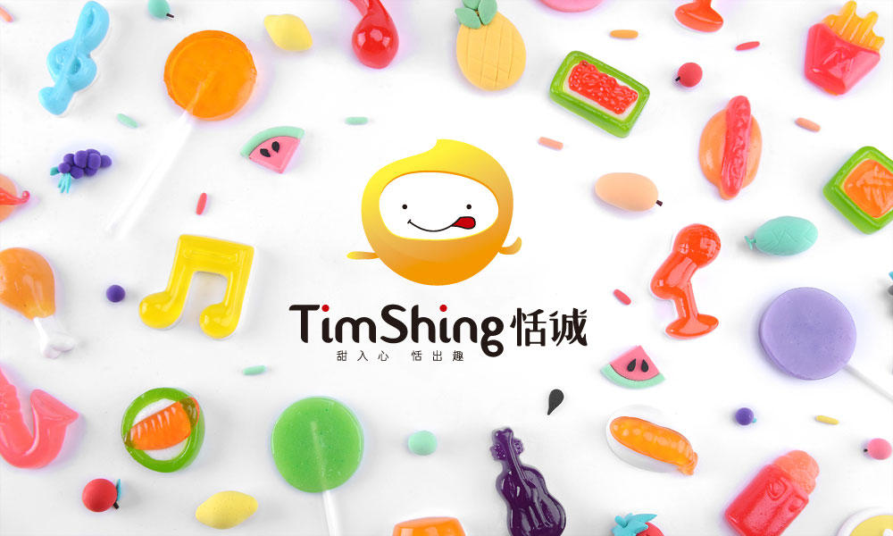
As a result, the team repositioned Tiancheng as a fashionable candy brand that focuses on innovation and deliciousness, delivering endless fun to the public while enjoying healthy and delicious candies, which not only relieves cravings but also relieves boredom, and positions "interesting, delicious, and fashionable" as the brand tone. Therefore, the team had the idea of incorporating candy elves into the brand, making the image of Tiancheng vivid, so as to convey fun and interesting emotions to the public. Therefore, in the design of the logo, the team incorporated the image of a lively and naughty candy elf; secondly, the elf showed an expression of licking its mouth, which not only implies that "Tiancheng candy is delicious, tasty, and makes you greedy when you see it", but also expresses the meaning of Tiancheng candy being "interesting and full of fun"; and in the font design, the two dots of the word "Cheng" are transformed into natural fruit pulp, implying that Tiancheng's raw materials come from nature and are safe and healthy to eat.
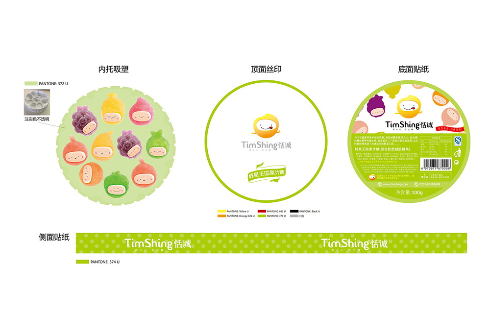
Purpose and results:
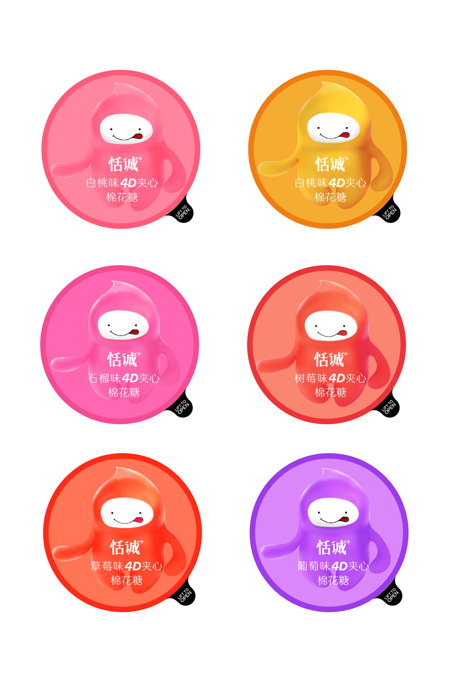
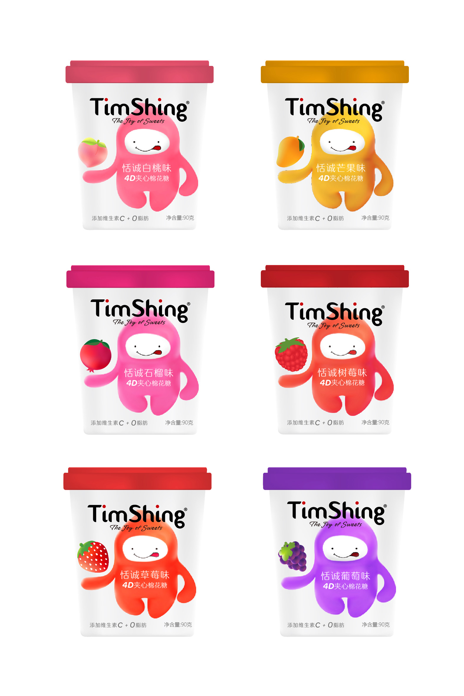
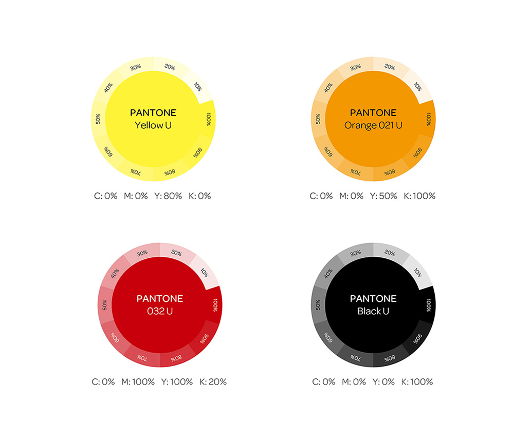
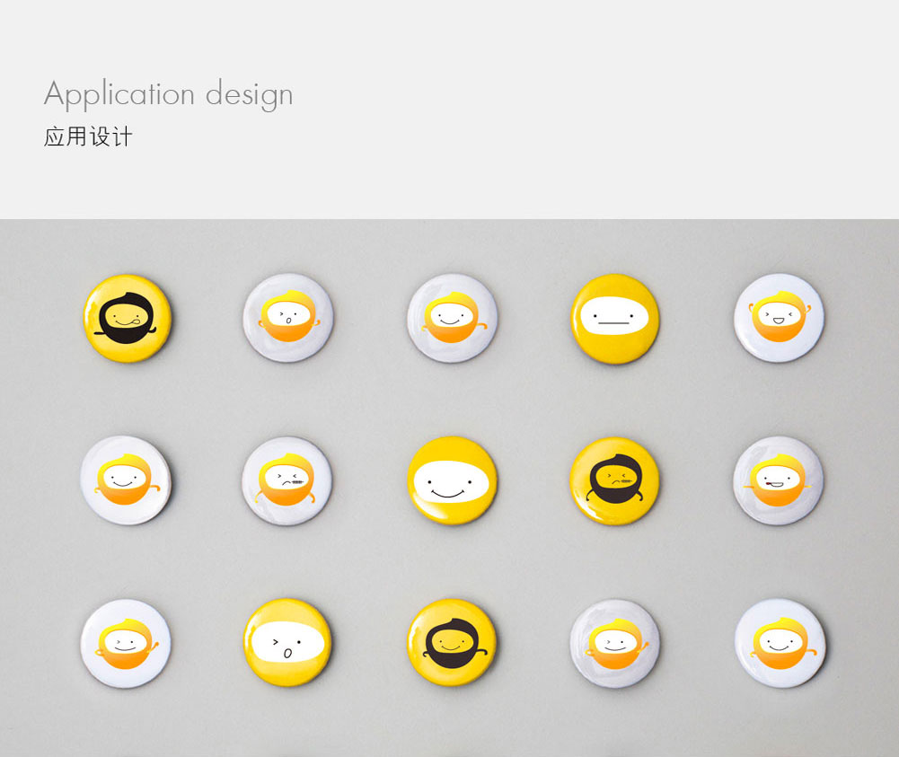
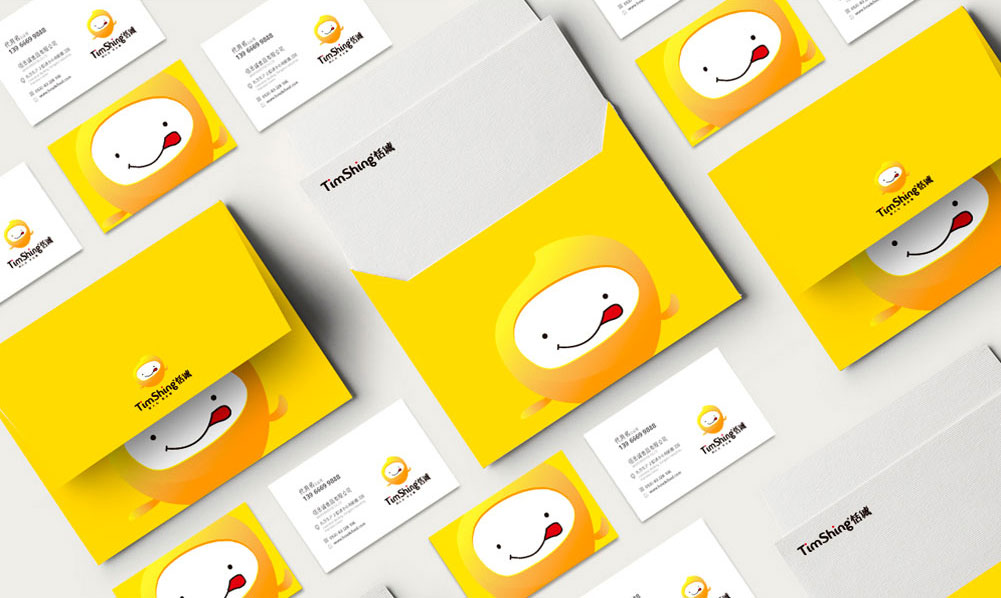
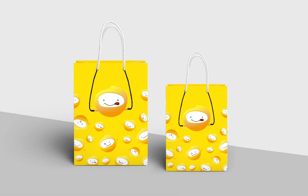
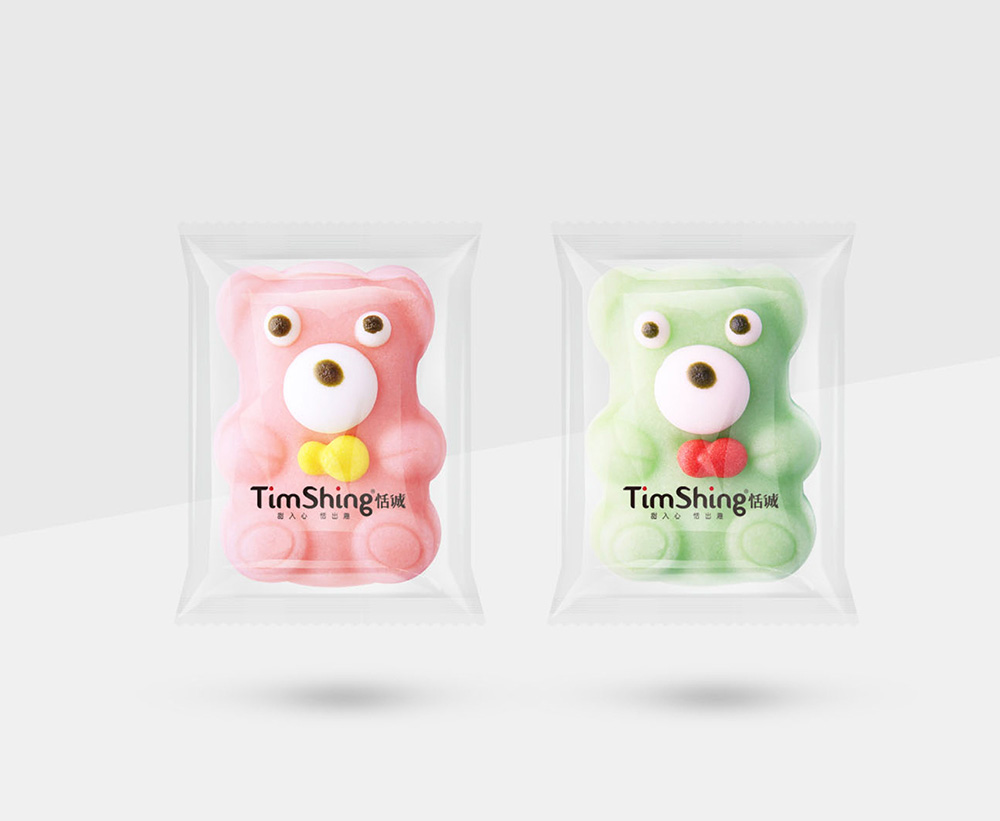
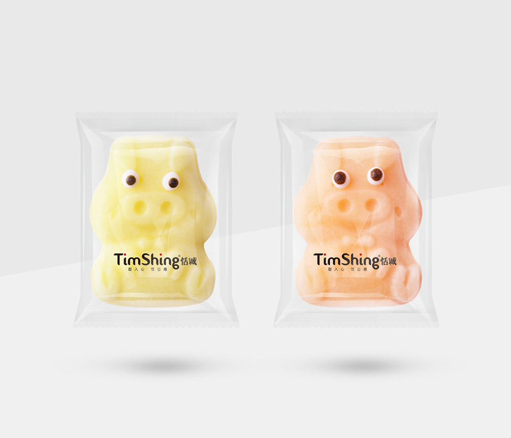
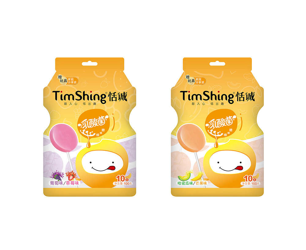
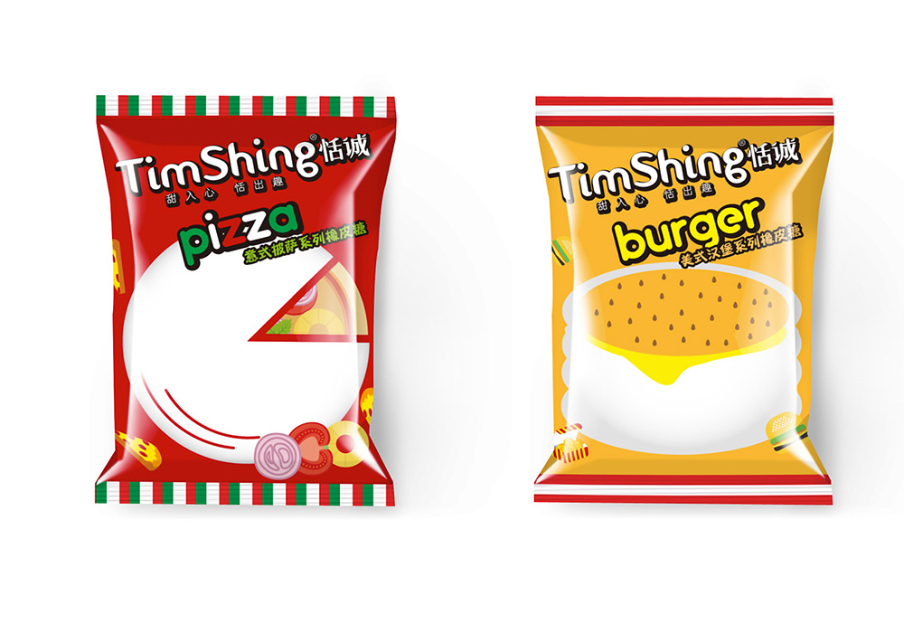
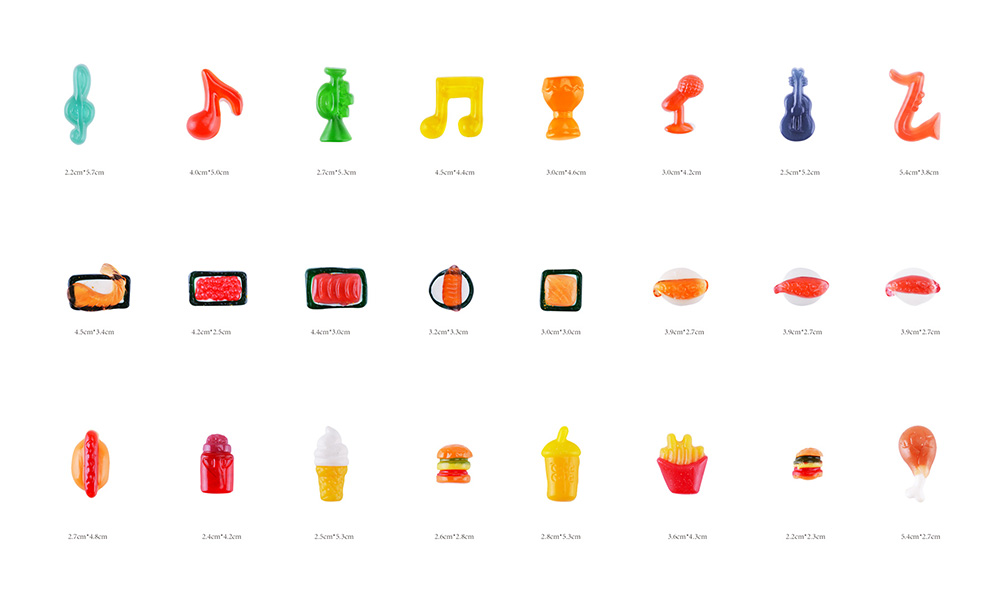
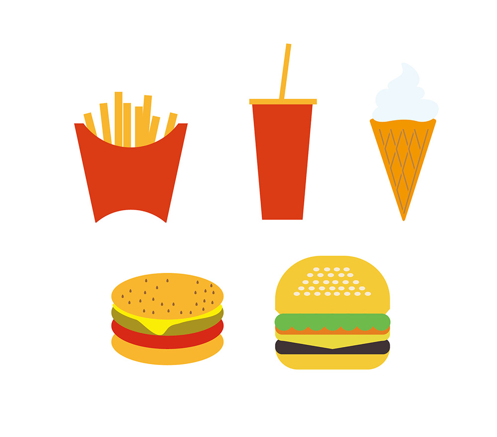
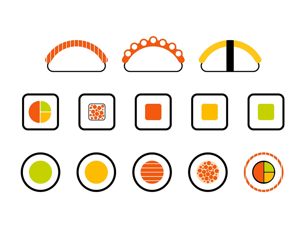
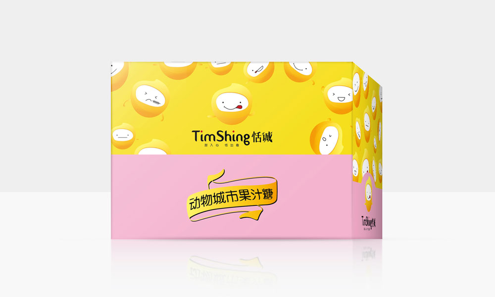
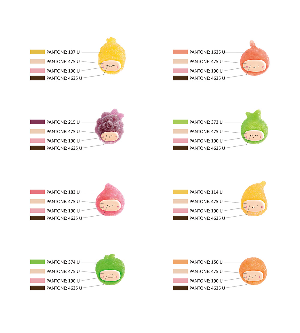
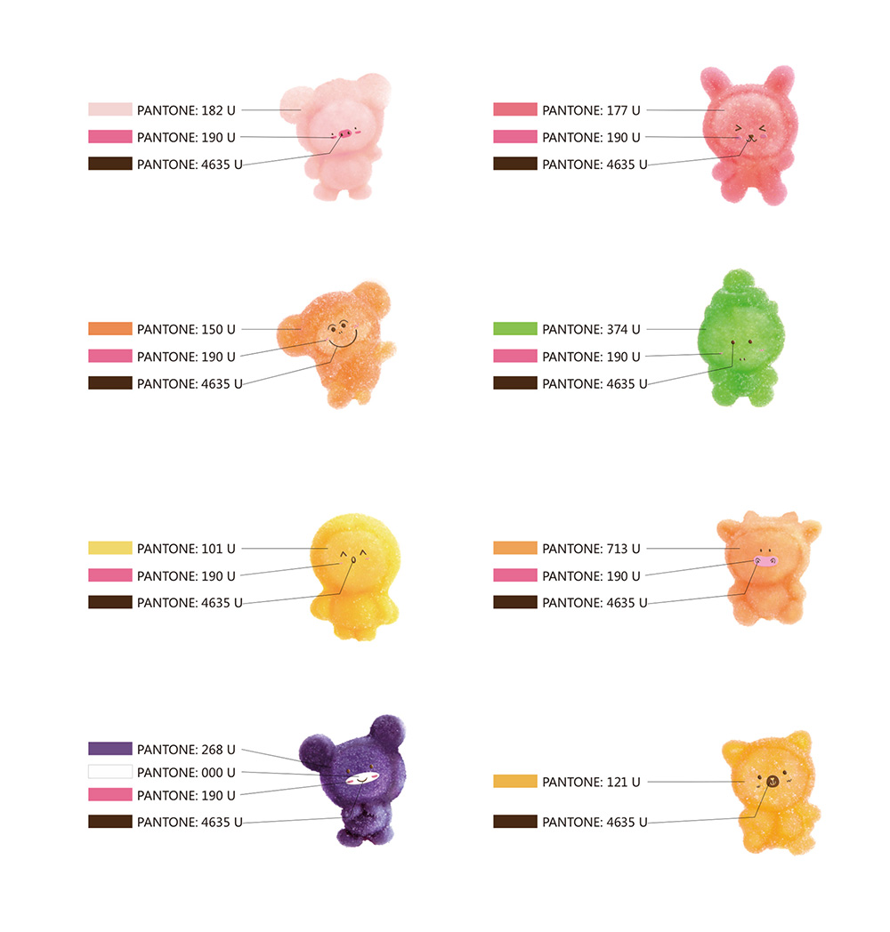
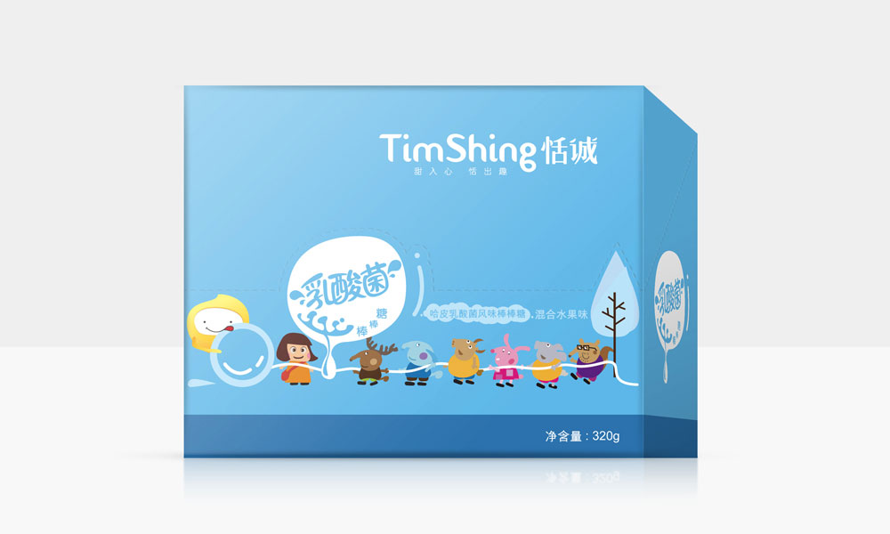
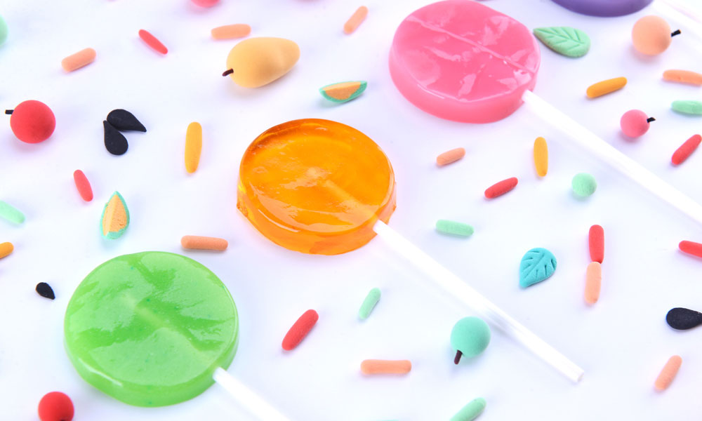
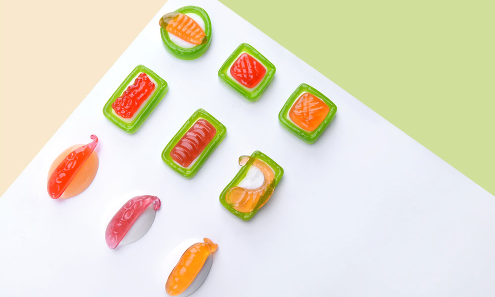
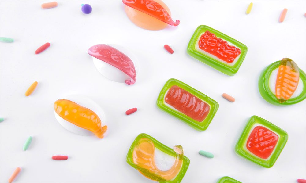
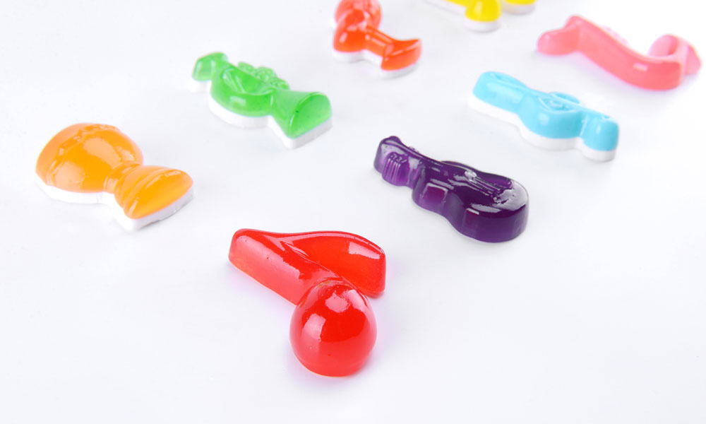
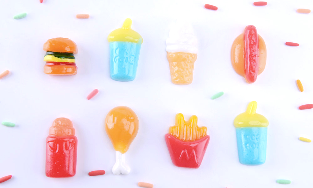
In packaging design, the team selected more eye-catching and colorful colors as the main colors of the packaging according to the flavor and style of the candy to attract more consumers' attention. In product design, the team changed the original big eyes of the cartoon candy to small eyes, making the candy more cute and innocent; and the candy expression combined with the current popular cartoon characters, emoticons and other drawing techniques, the overall shape of the candy became more interesting and attractive, in order to capture more young consumers who pursue trends and fashion. In the future, Tiancheng Candy will continue to work with the team to jointly develop and create fresher, more fun and higher quality candies, pass on the fun spirit of "Tiancheng is fun and sweet to the heart" to more candy consumers, and bring a fresh experience with a unique Tiancheng color to global candy consumers.

© All rights reserved. BLUE Benlai Design Co., Ltd. XML ICP13085632