Category:Cosmetics
Material:Wrapping paper-metal-PE-glass-wood-matte acrylic
Client:Guangzhou Huaijie Group
Material:Wrapping paper-metal-PE-glass-wood-matte acrylic
Client:Guangzhou Huaijie Group
Project background:
Expectant mothers are very cautious when purchasing maternity skin care products, and they consider many more factors than when purchasing general skin care products. In addition to word of mouth and professional recommendations, expectant mothers will also judge the reliability of the product from the texture of the product
itself.
As a well-known professional maternity skin care product in China, Qinrun has a good reputation and sales, but after purchasing the product, consumers generally reflect that the product packaging and design are different from their expectations in terms of texture. How to improve the product and brand image through VI upgrades on the basis of continuing the existing achievements, so as to increase the trust of expectant mothers in the product and continue the popularity of the product, is the problem we need to solve this time.
Solution:
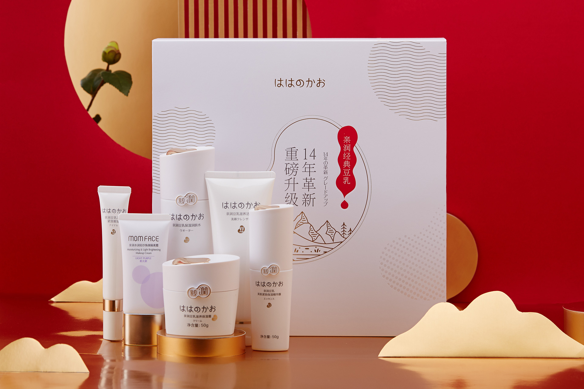
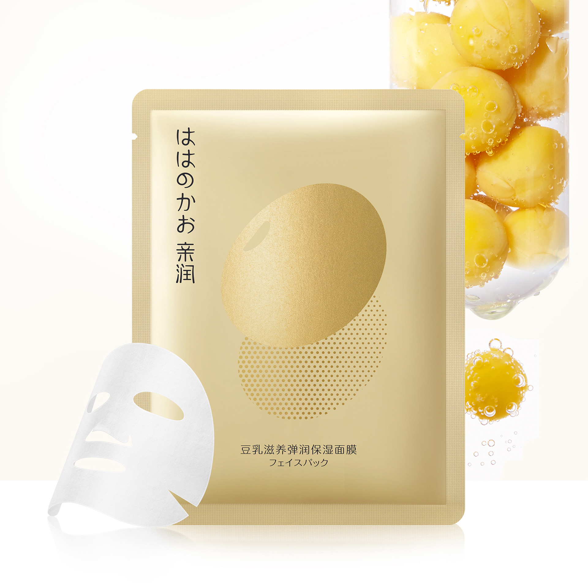
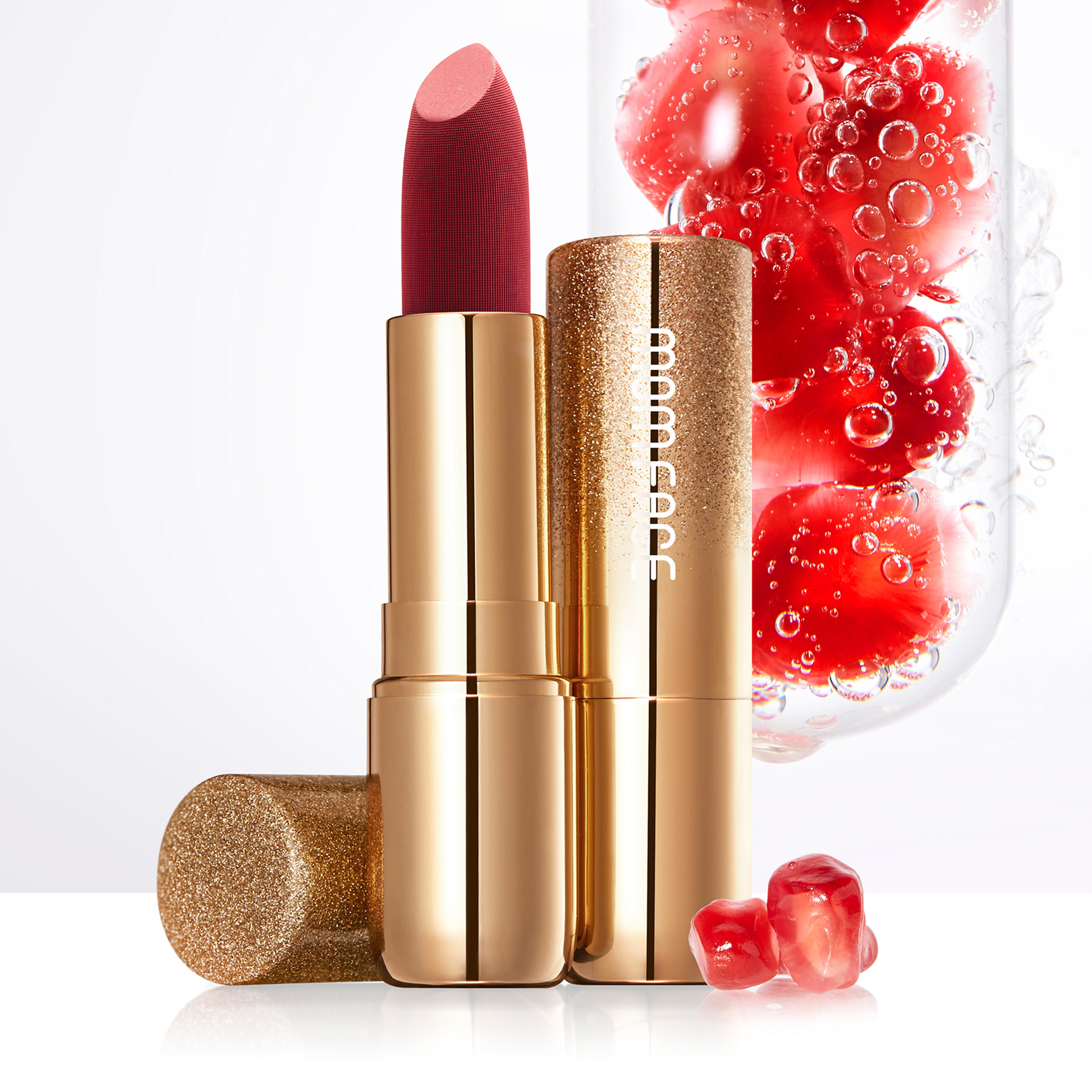
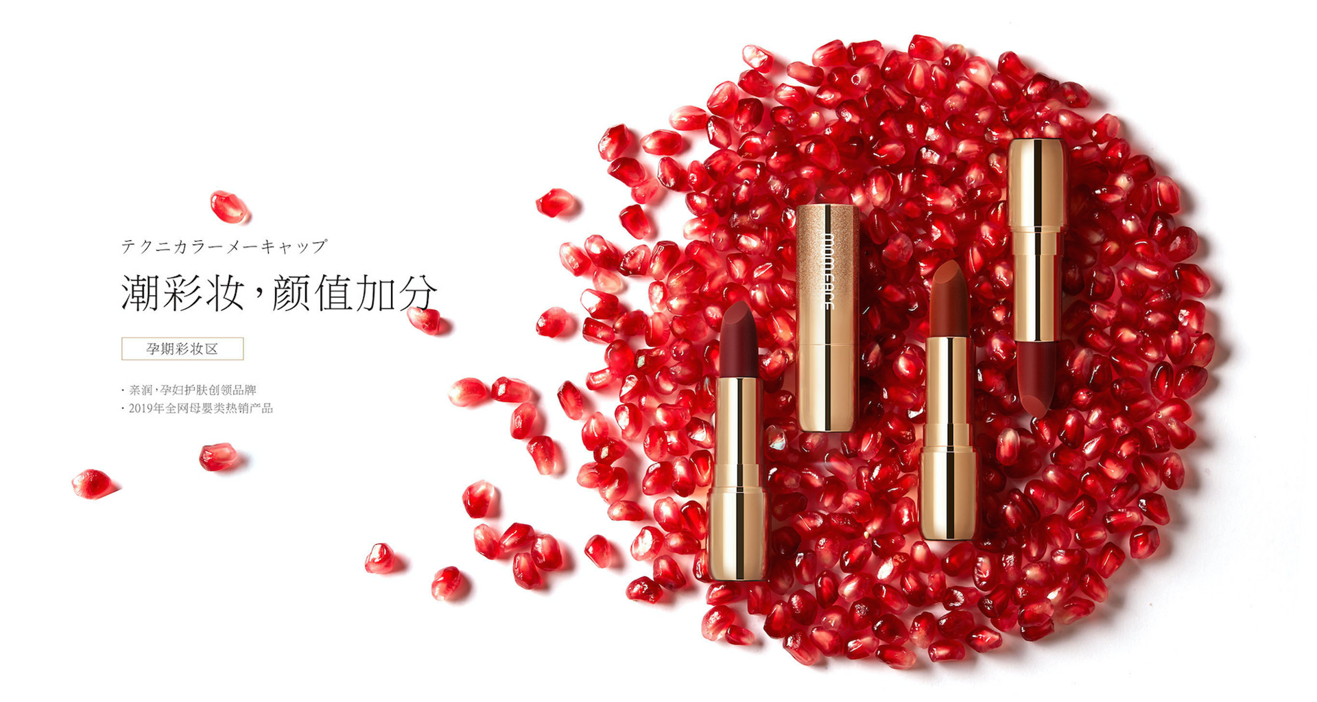
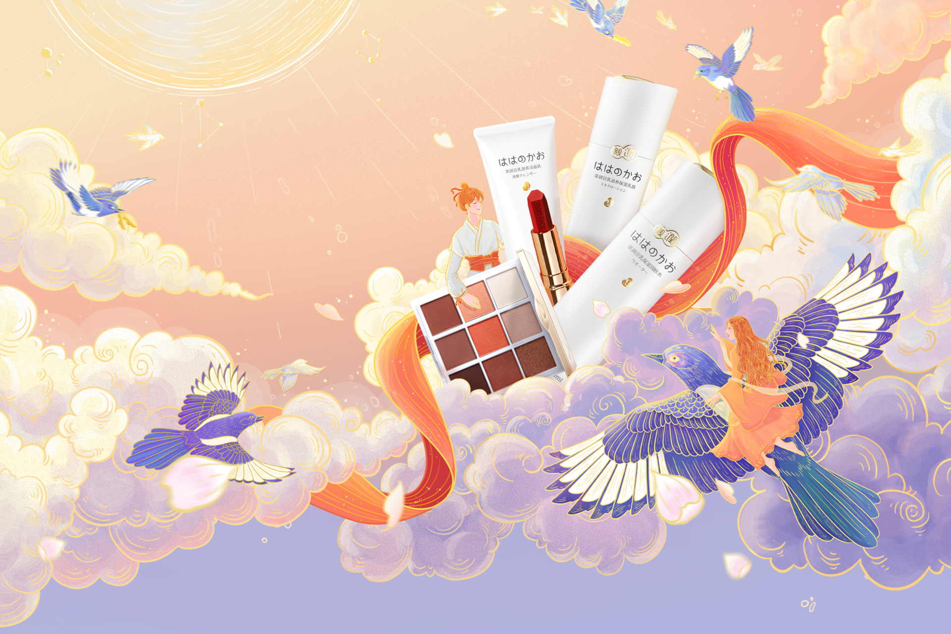
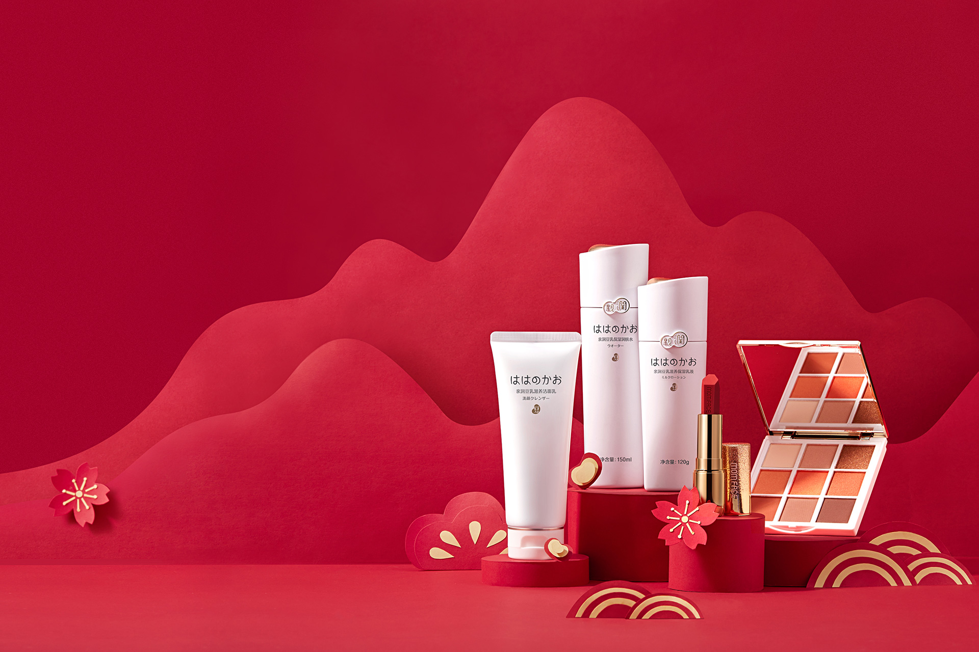
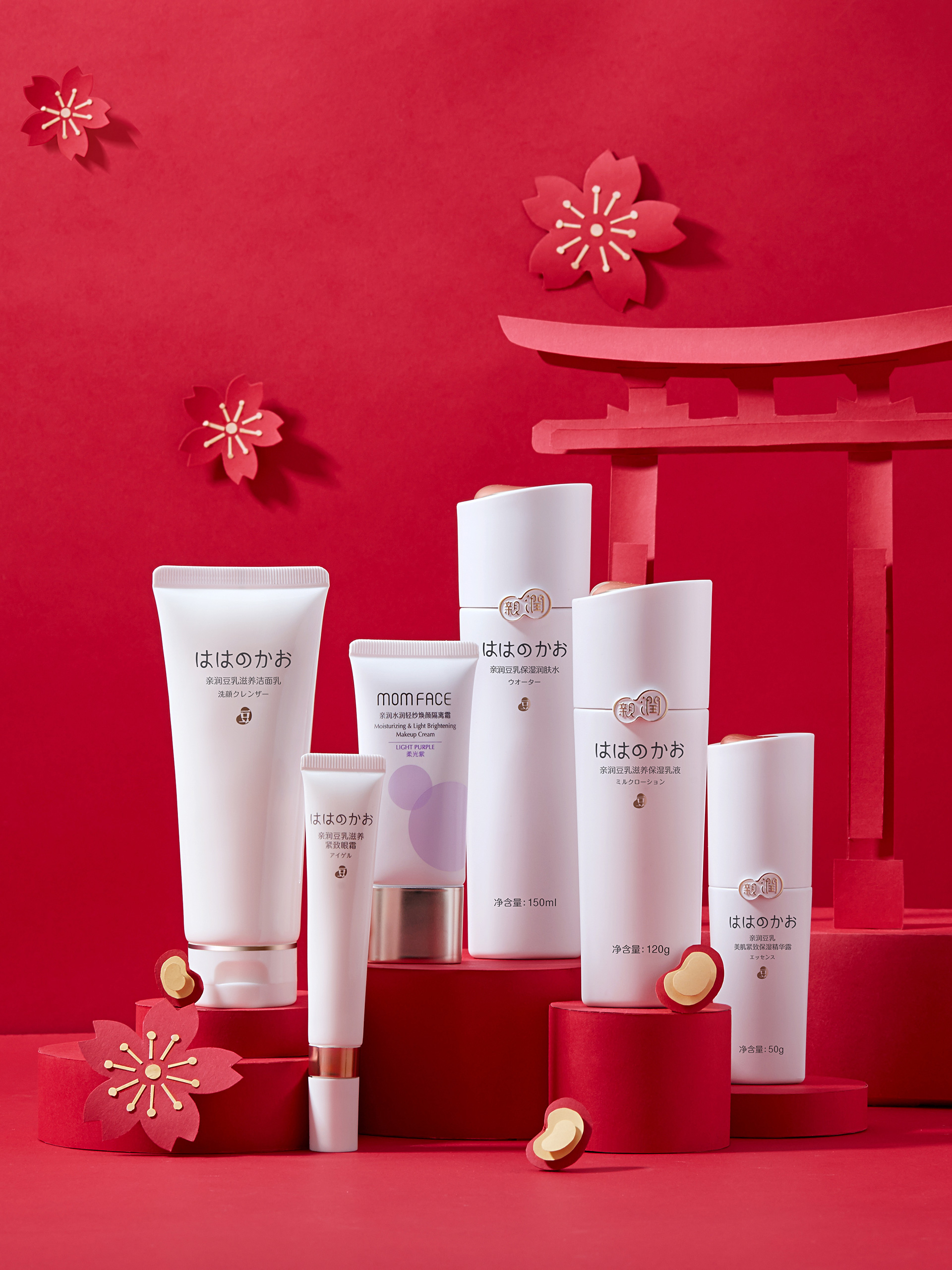
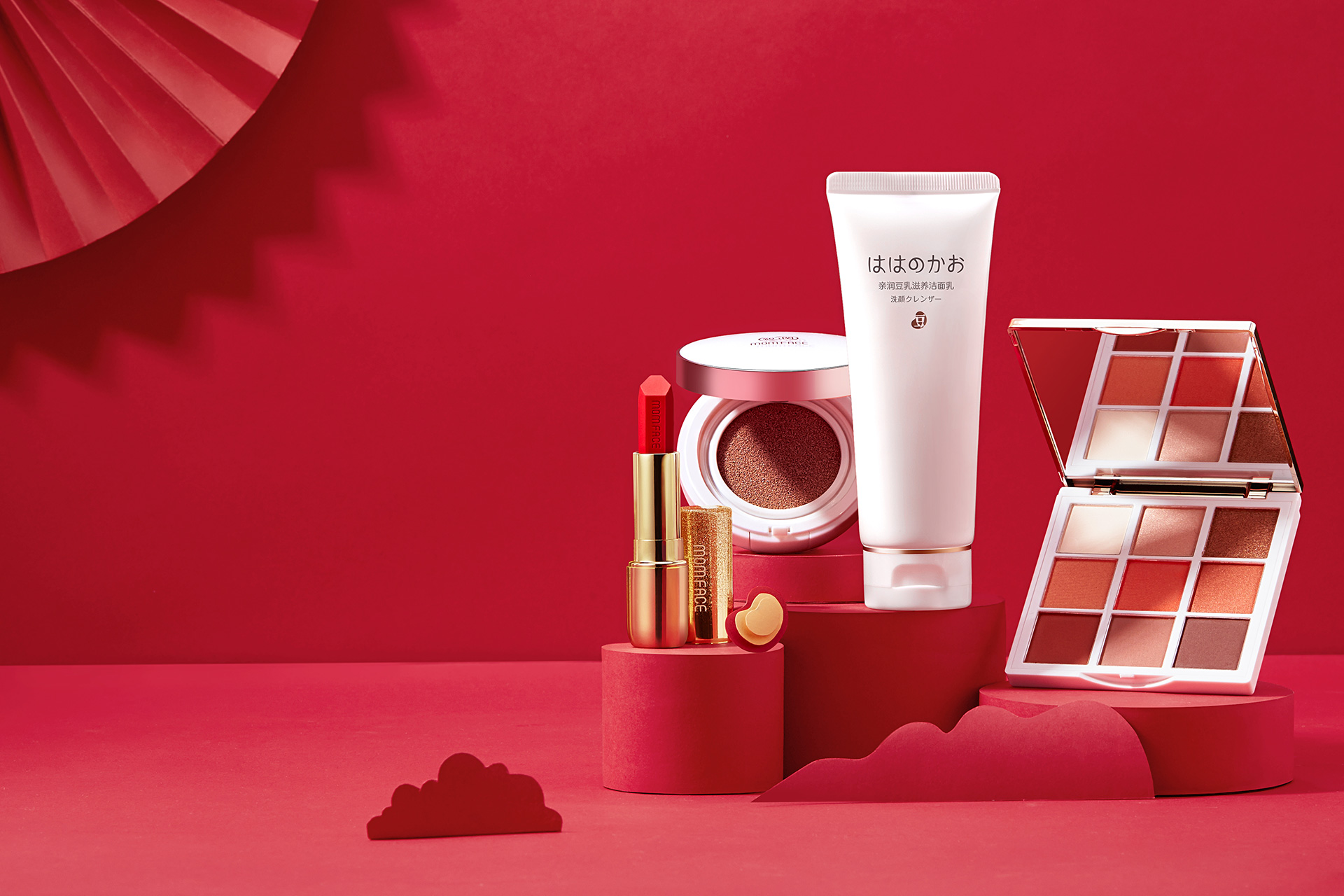
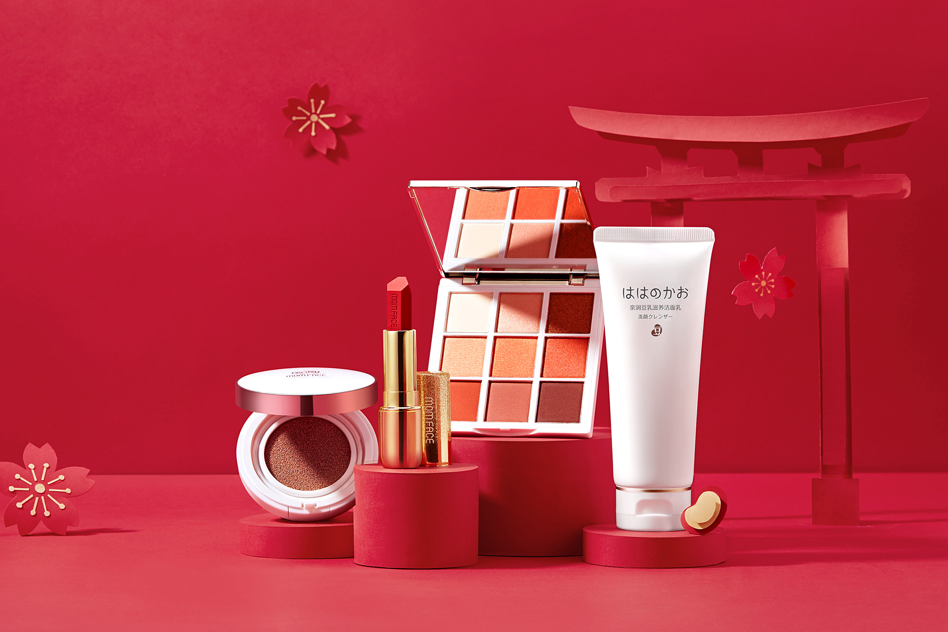
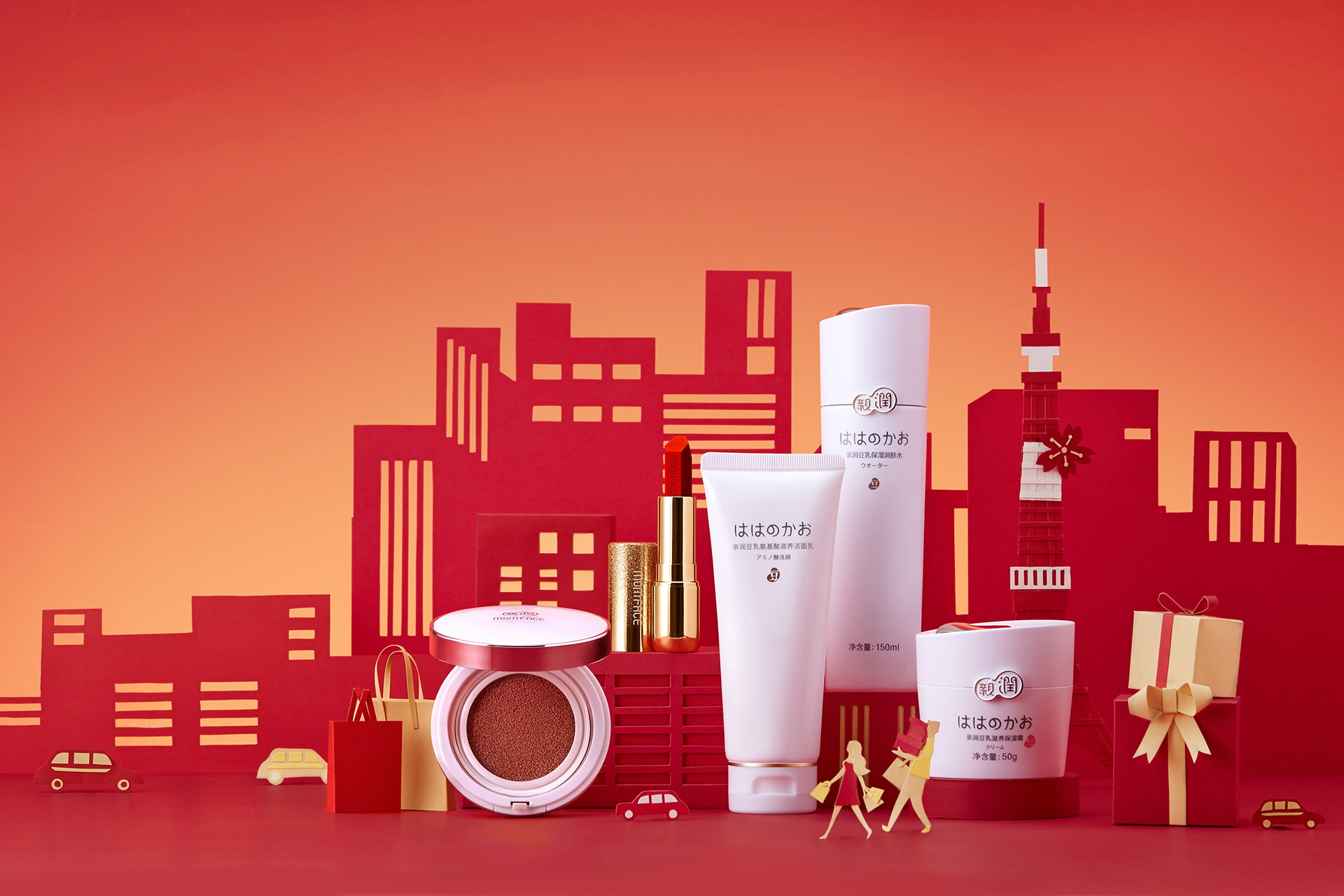
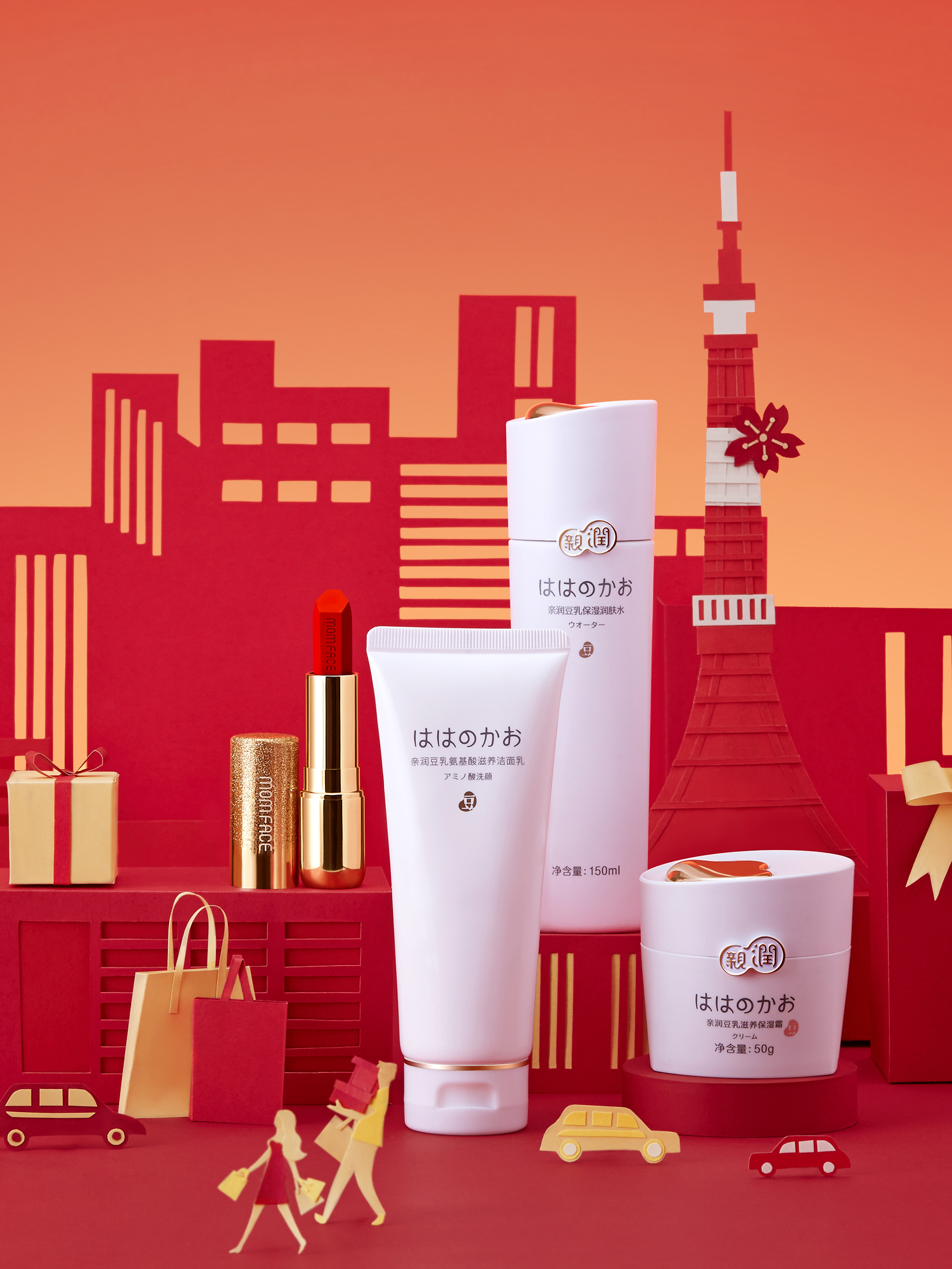
After discussion, the team sorted out the brand's genes and decided to maintain the brand tone and previous brand image of Qinrun, from basic VI to product design, from a business card to Tmall webpage, all are marked with Qinrun's "natural, gentle, professional" brand, and a thorough upgrade of the brand from visual image design.
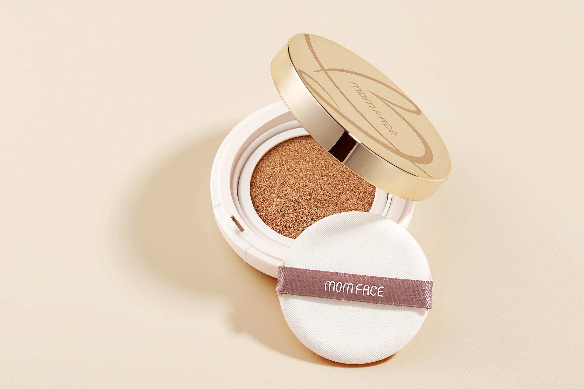
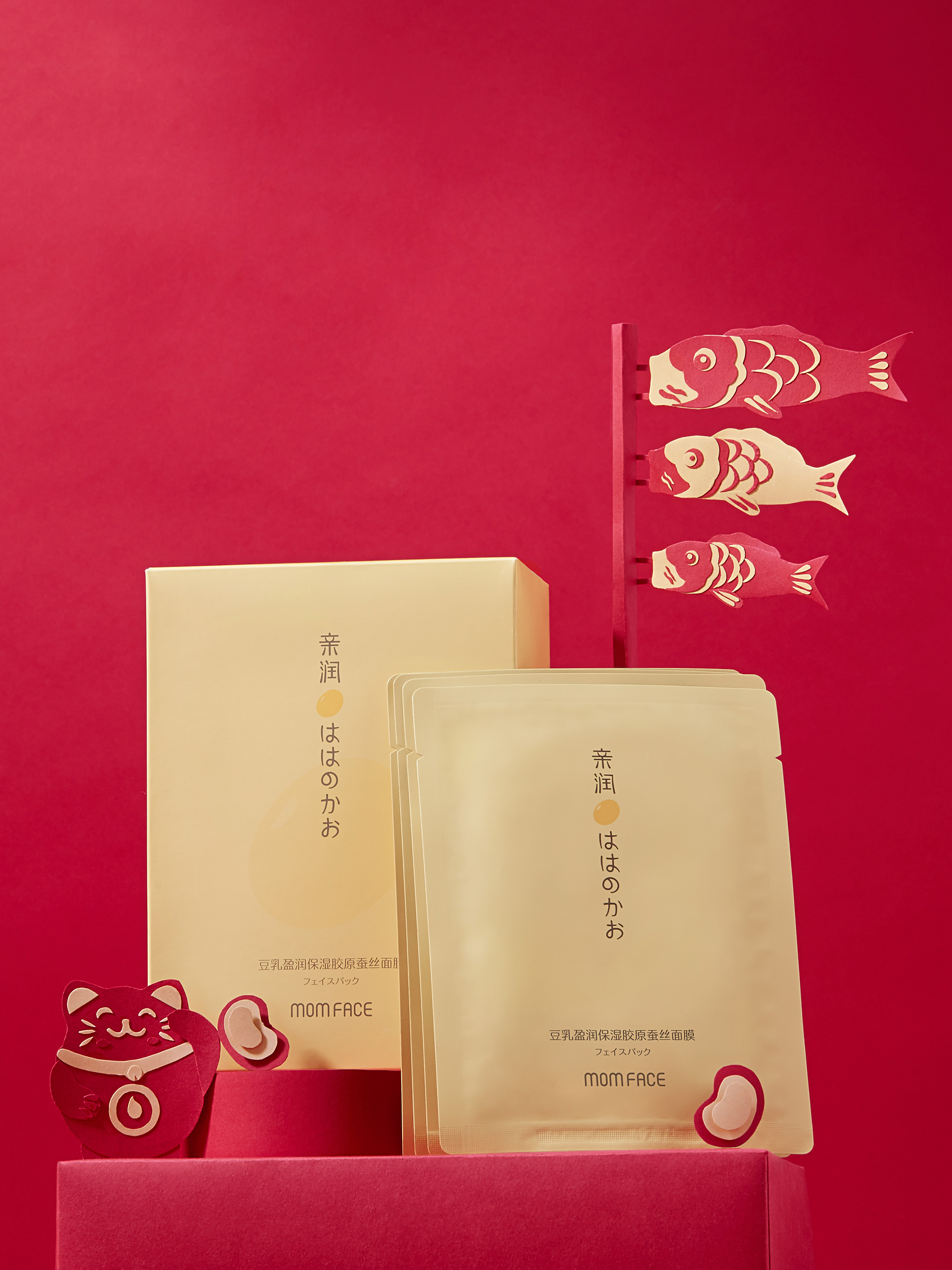
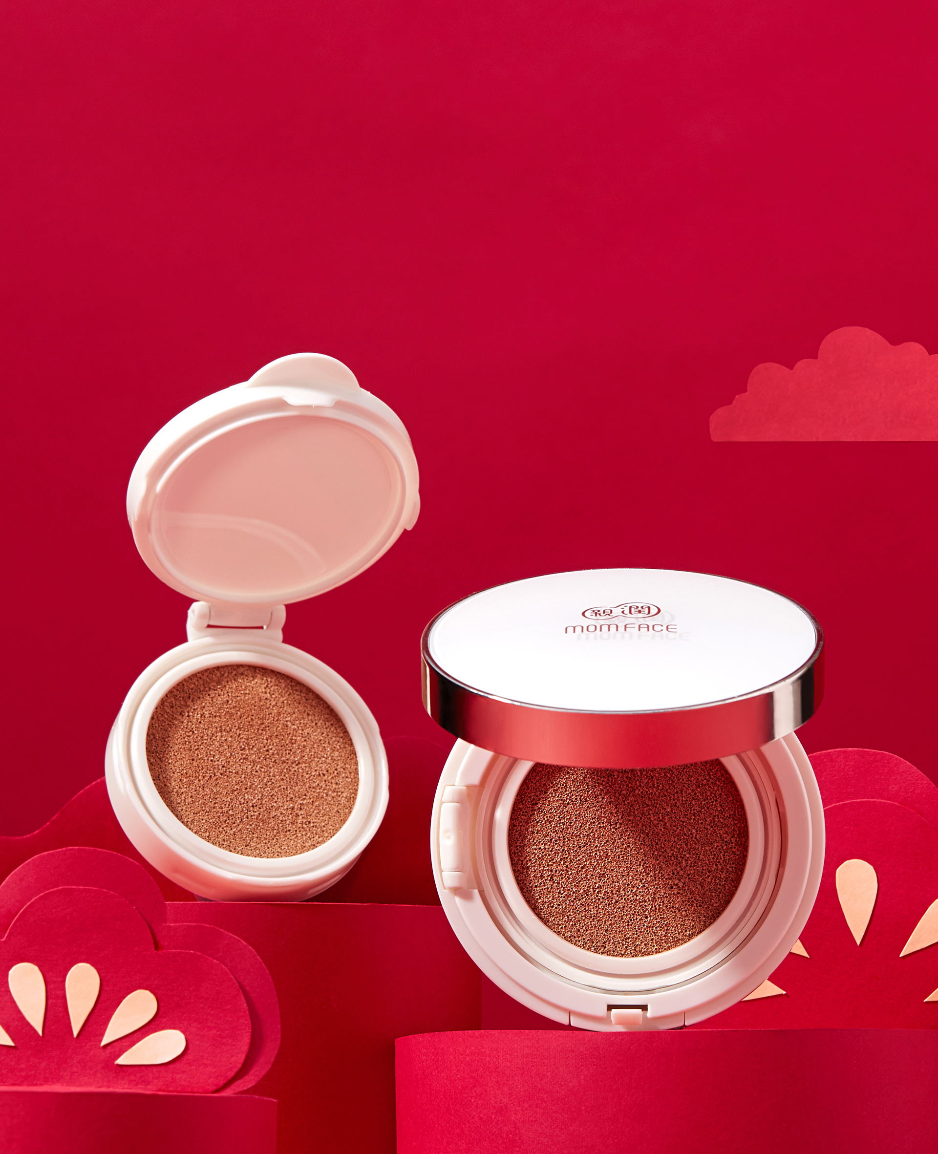
When upgrading the Qinrun logo, the team regularly optimized the text design to make the brand name look more professional and textured; and replaced the auxiliary graphics with a picture of an Asian-faced pregnant mother caressing and stroking her pregnant belly, and added "for pregnancy and childbirth" on the top of the icon to enhance the brand's image of "professional pregnancy and childbirth skin care products".
Purpose and results:
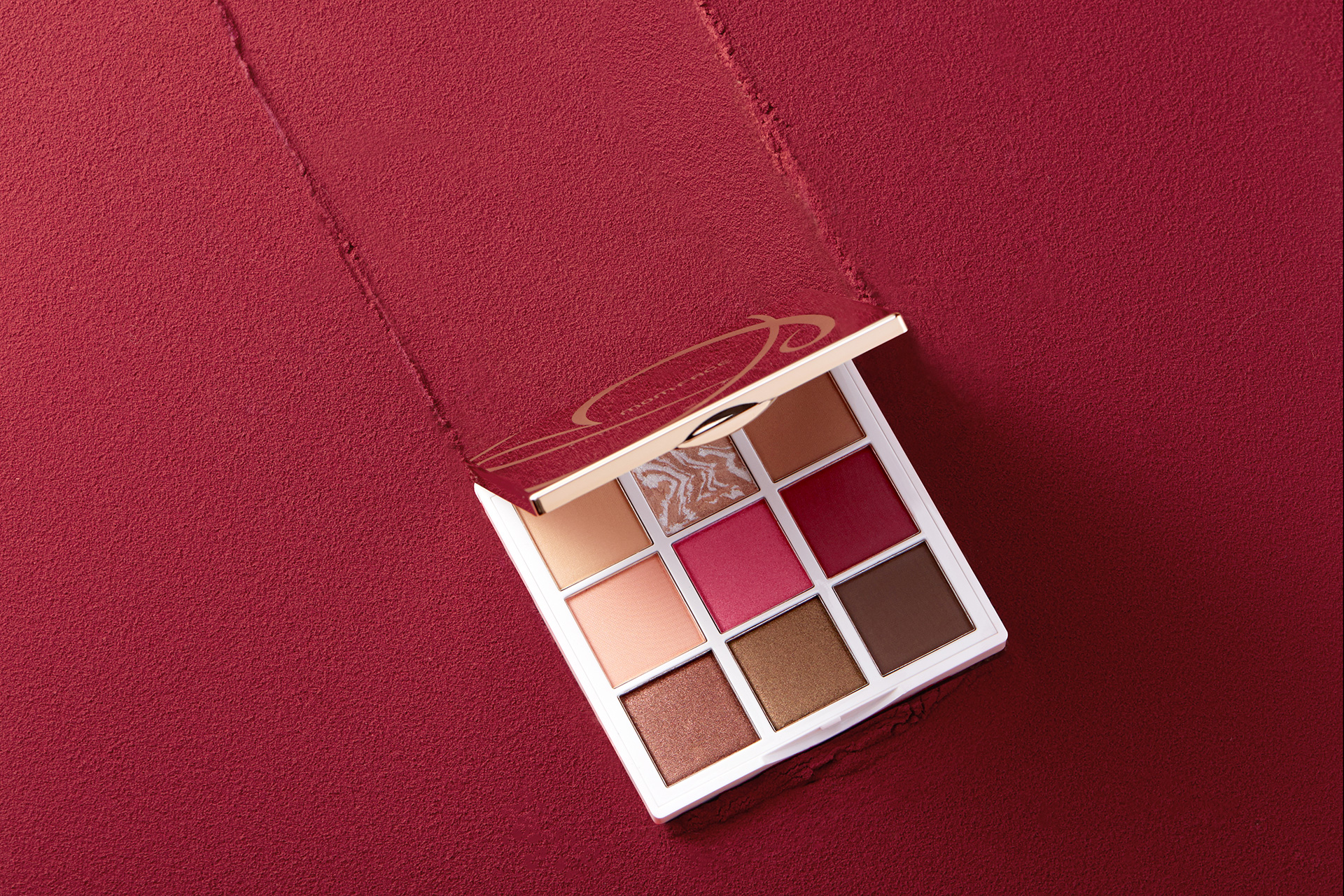
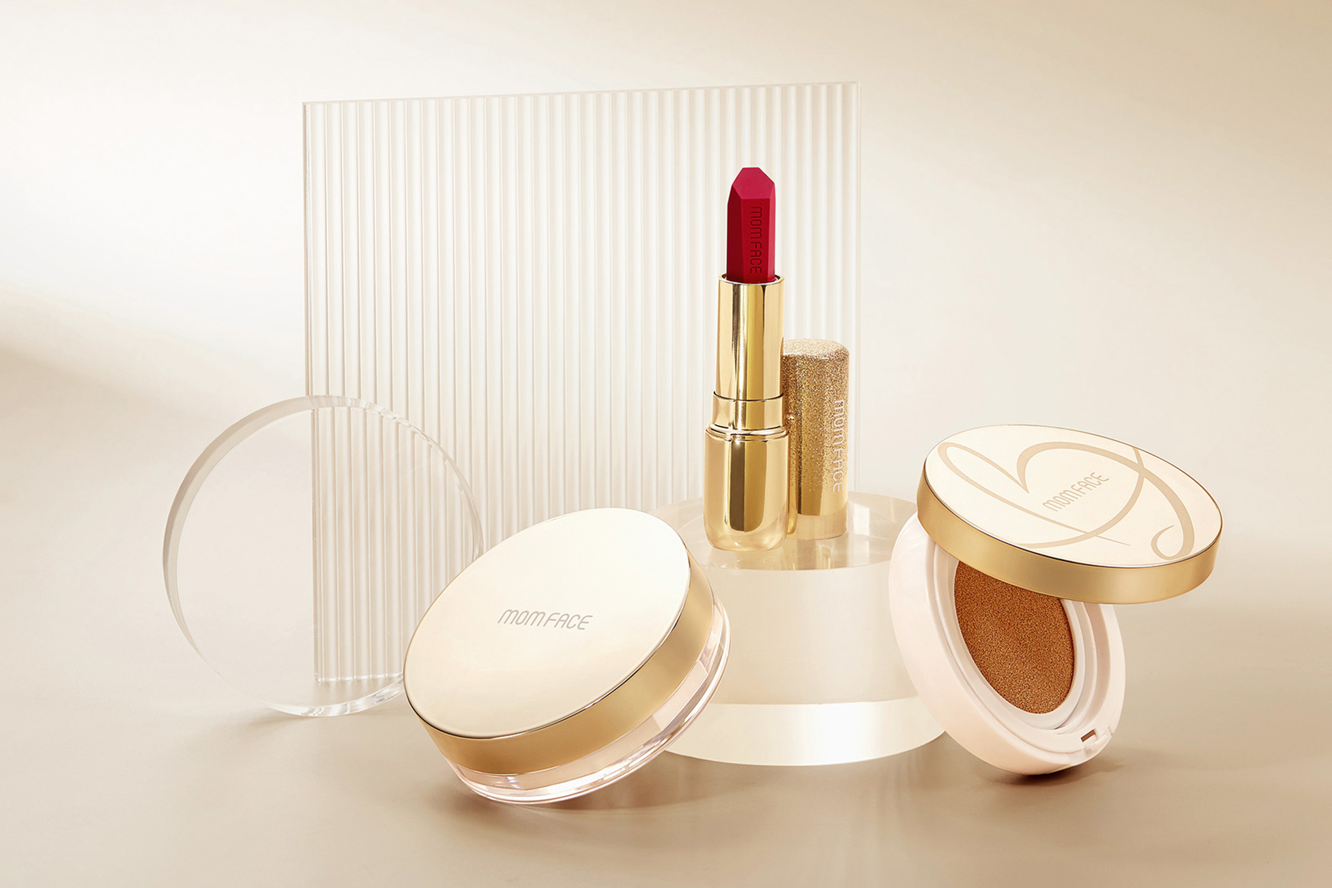
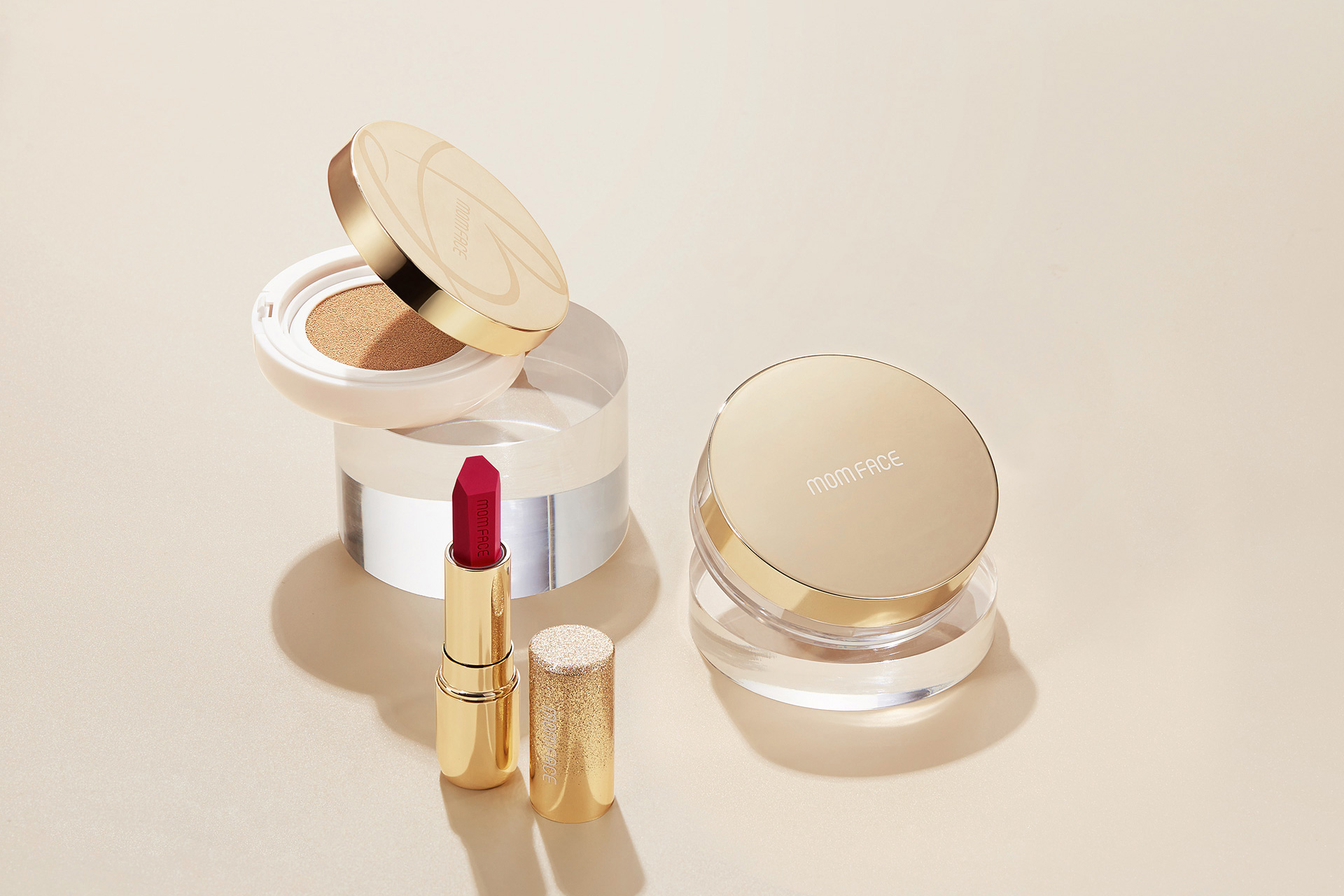
In terms of the brand's main color, the team changed the brand's main color from the original dark yellow to a more natural and durable brown, which is more in line with the color of the product's raw materials, beans, rice, and apple seeds, and is more in line with Qinrun's brand concept of "makeup and food are of the same origin" and "original ecological skin care".
After the upgrade and optimization, the sales of Qinrun's entire product line on Tmall have increased significantly, and many users have reported after purchase that "the texture is excellent, which is in line with Qinrun's current status and the expectations of the brand in people's hearts."
© All rights reserved. BLUE Benlai Design Co., Ltd. XML ICP13085632