Category:Cosmetics
Material:Wrapping paper-PE plastic-Glass
Client:Guangzhou Yuanmei Cosmetics
Material:Wrapping paper-PE plastic-Glass
Client:Guangzhou Yuanmei Cosmetics
Project background:
Xiquan professional line is a brand with 15 years of history, with advanced production base, independent R&D technology, and rich and effective professional skin care products. However, the previous packaging lacked recognition and memory points, and could not reflect the brand's 15 years of accumulation and current brand image. Among the many products in beauty salons, how to let consumers intuitively feel the strength of Xiquan through product image enhancement? The survey found that 25-40-year-old beauty-loving women who are used to doing skin care in beauty salons have a strong interest in professional skin care products and will actively look for products suitable for themselves. They will choose professional and suitable products for themselves based on their own understanding of beauty knowledge.
Solution:
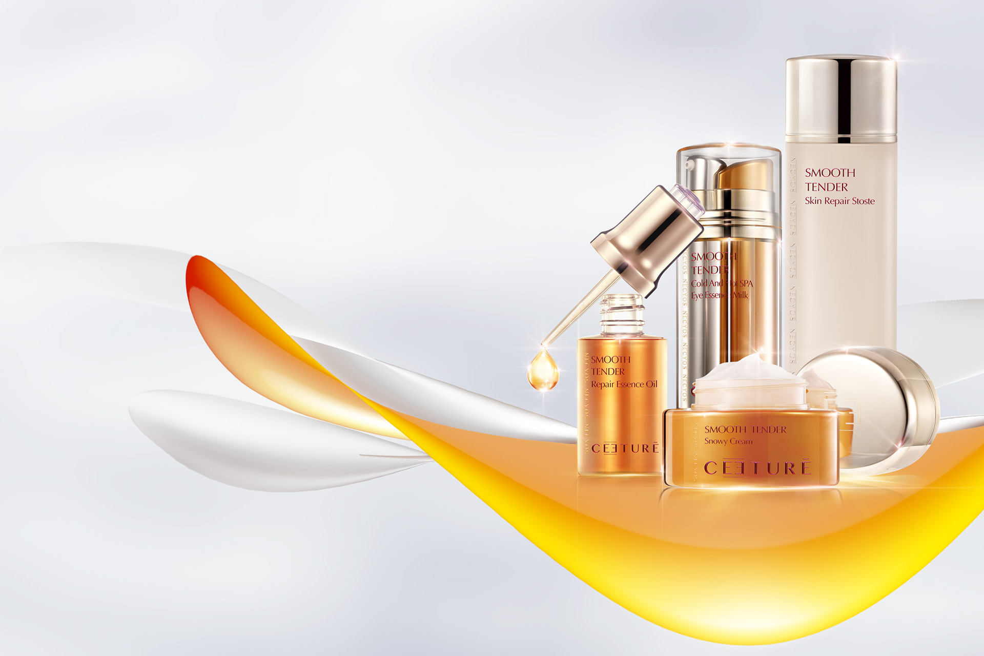
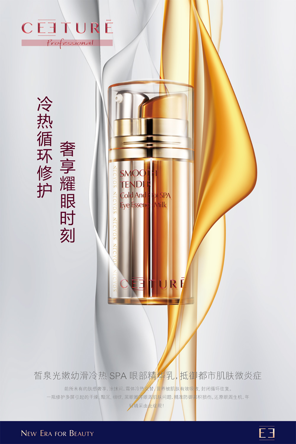
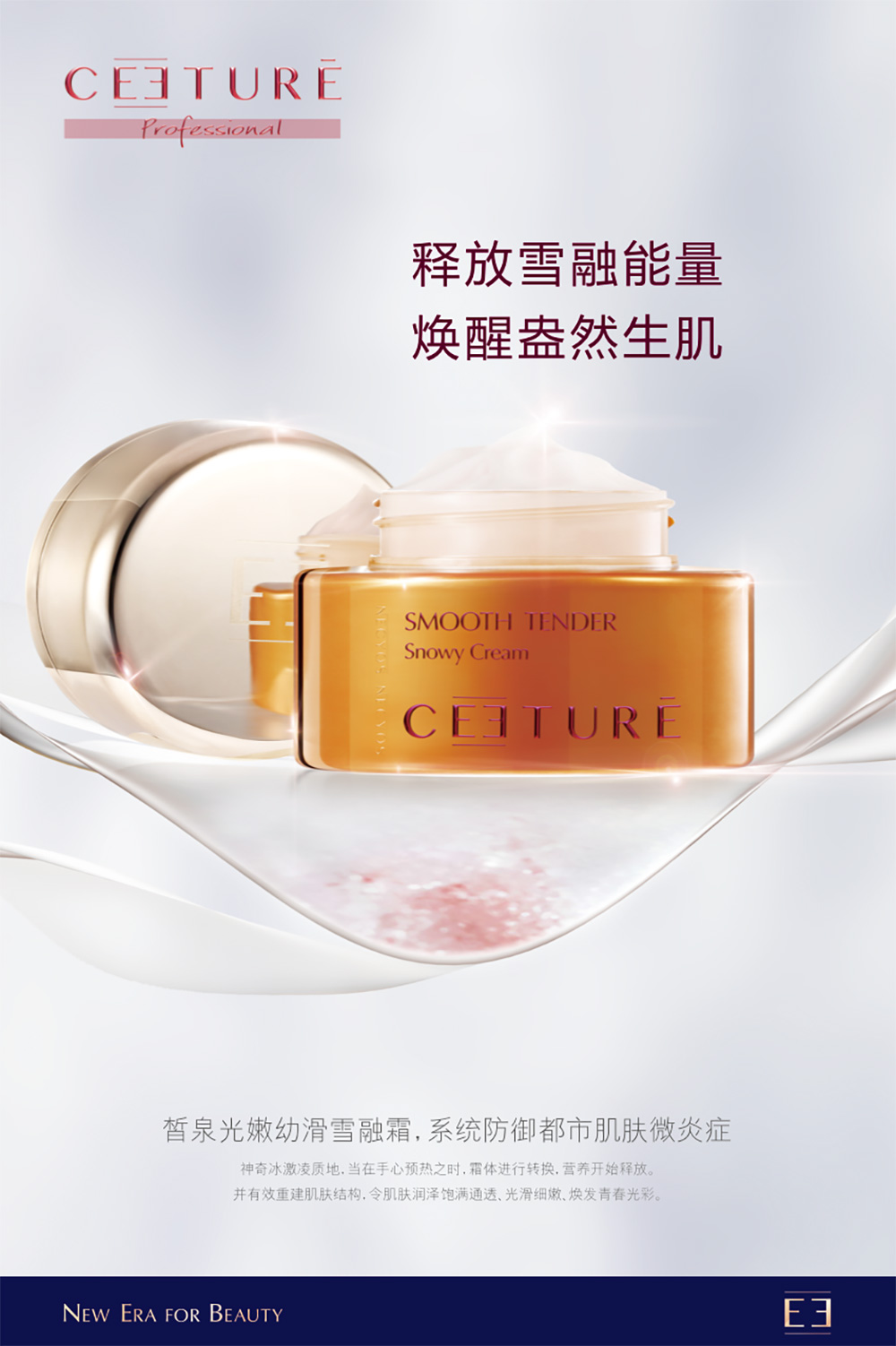
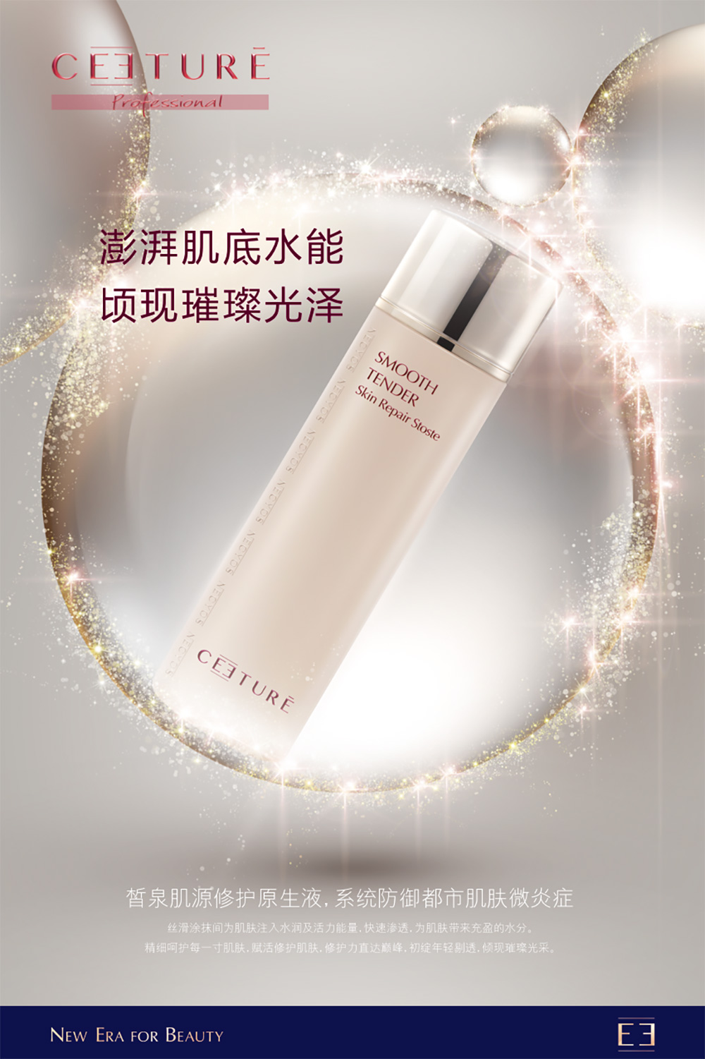
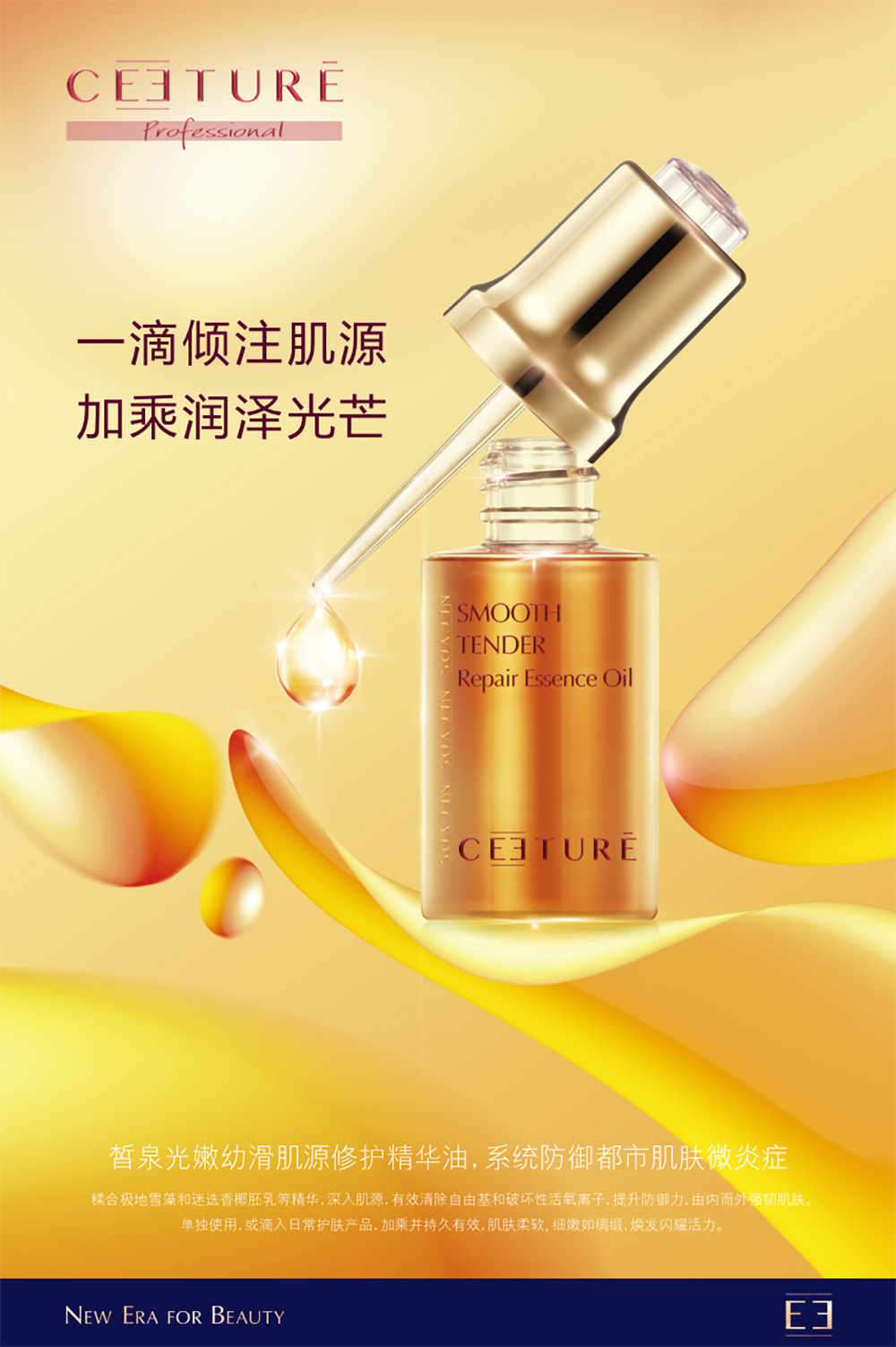
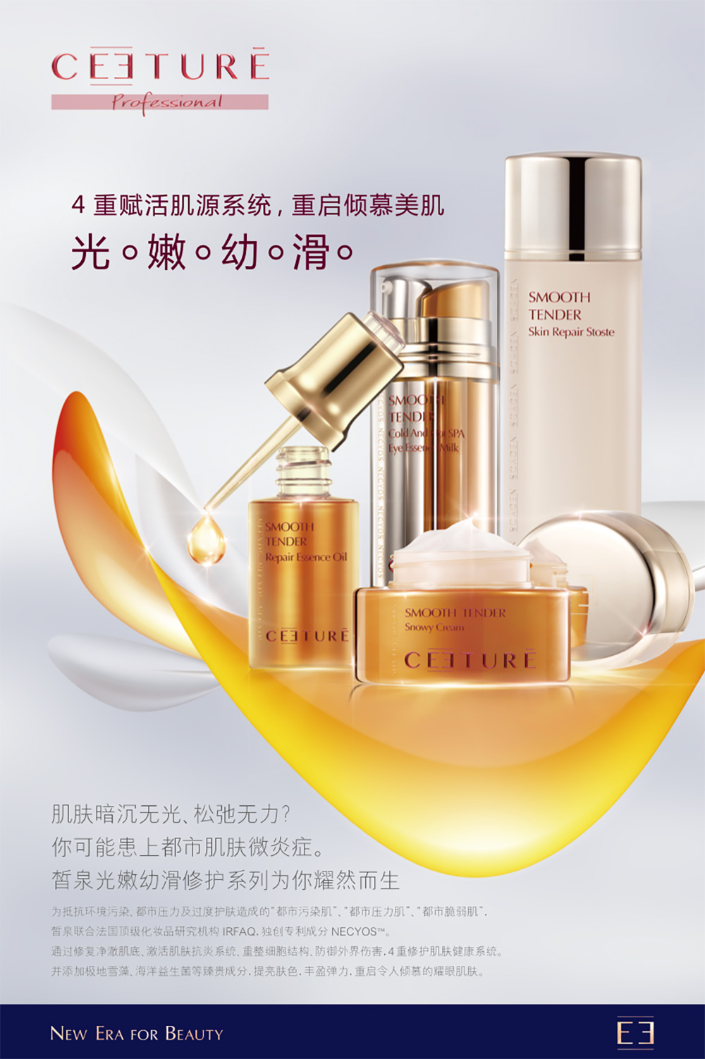
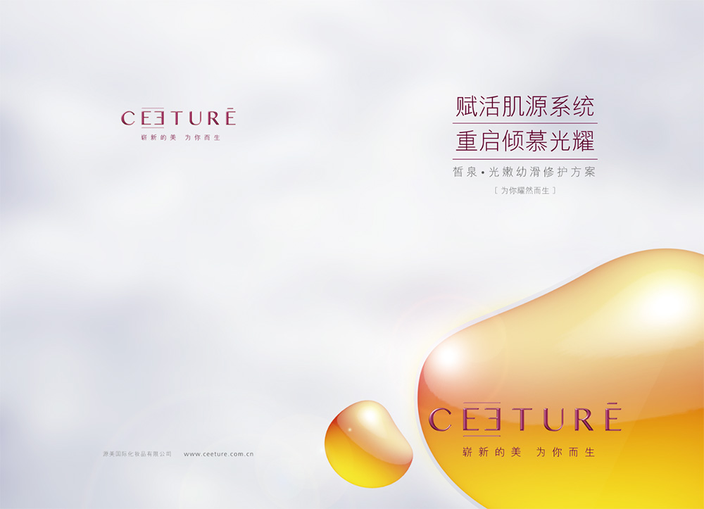
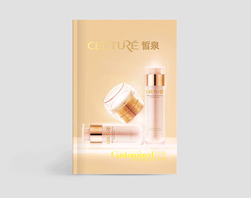
For this reason, the team decided to enhance the brand's visual image while maintaining the brand's personality and tonality. The overall design is close to international first-line brands, and the packaging design reflects more "professionalism, technology, and texture" so that consumers can intuitively feel the strength of Xiquan. In logo design, the team used symmetrical aesthetics to design a new ceeture logo, adjusting the traditional arrangement of the double E and cleverly connecting them into symmetrical and opposite double E. The contrast between the two makes the harmonious beauty stand out, which enhances the overall sense of the logo and implies the close connection between Xiquan and women and the expectation of mutual understanding. At the same time, it also looks like the Chinese character "恒", which means to connect and continue everything. It symbolizes the brand culture of ceeture's continuous development, bold innovation, and connection to the future, and fully expresses Xiquan's brand pursuit of "new beauty, born for you".
Purpose and results:
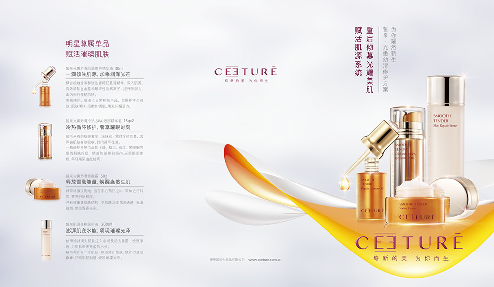
In packaging design, we chose materials with more texture and close to first-line brands; and selected different series main colors according to the different styles of different series, so as to highlight the highlights of different series without departing from the brand's "professional, technological, and textured" tonality, and bring consumers a systematic and unique product visual image. In album design, the team continued the simple and clean style to better highlight the brand culture and product introduction. In the future, Xiquan's solutions and product development will take solving "urban skin problems" as the basic starting point, continue the brand style and new visual image, pay attention to people's potential needs, and lead the new direction of consumption. It will present consumers with a complete product series of intensive care to meet all-round and complete care.


© All rights reserved. BLUE Benlai Design Co., Ltd. XML ICP13085632