Category:Cosmetics
Material:Wrapping paper-Metal-PE plastic-Glass-Bamboo-Wood
Client:British Tree Gene Technology Group
Material:Wrapping paper-Metal-PE plastic-Glass-Bamboo-Wood
Client:British Tree Gene Technology Group
Project background:
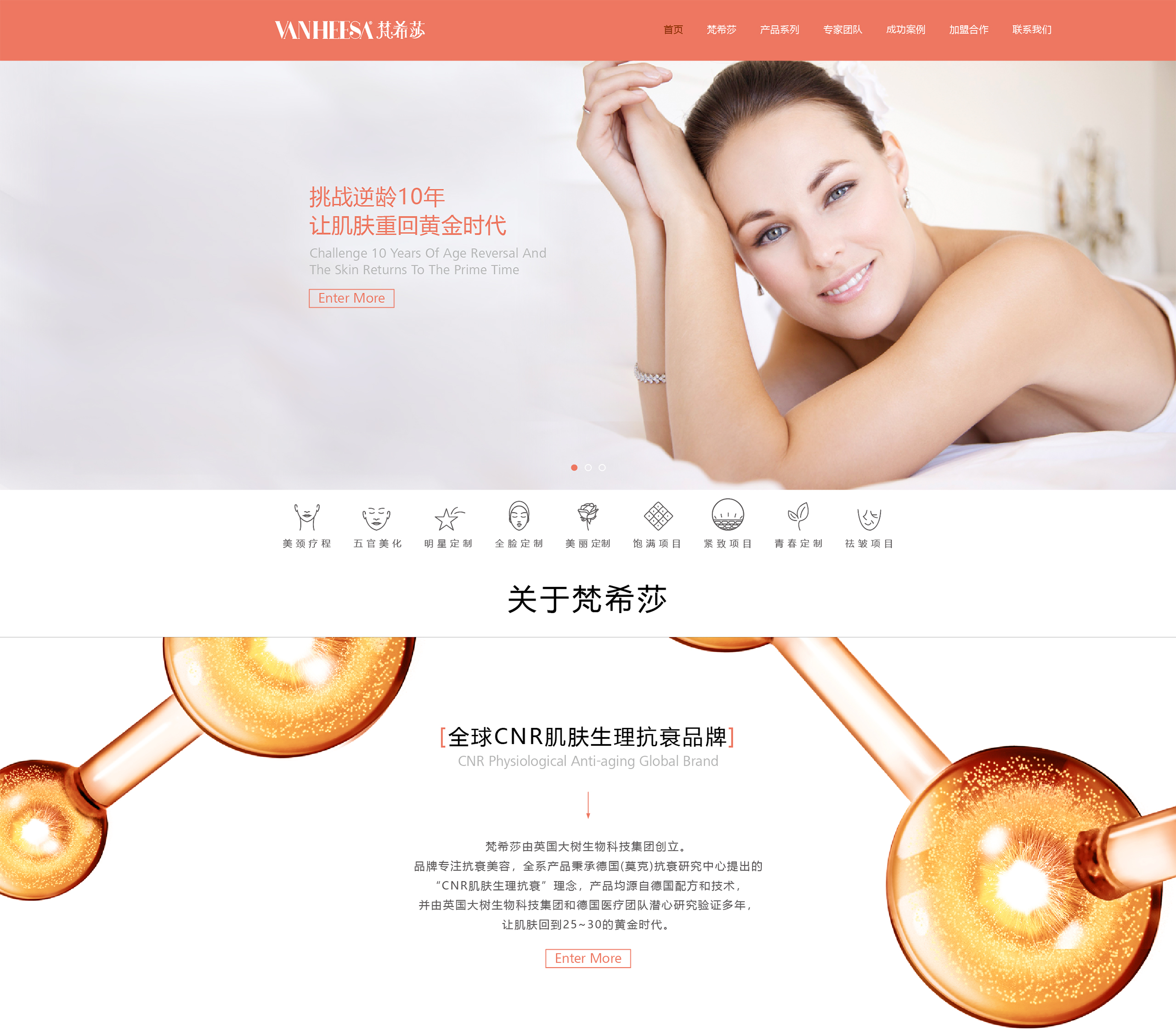
Love of beauty is the nature of every woman, regardless of age. When women have entered the mature stage of life, their pursuit of beauty has not stopped. They are becoming more and more independent and tasteful, and no longer obey the traces left by time. The medical anti-wrinkle brand Fanshisha, jointly created by Guangzhou Aoyu and British Dashu Technology, is committed to solving the skin aging problem of urban high-end women. After elite women enter their 40s, their families are mature and stable, harmonious and stable; they also gain more space in their careers, have their own teams and social resources; they pursue excellent quality and enjoy high-end style in life, entering the golden age. But the skin at this time is just the opposite, gradually out of control, and loses its youthful brilliance. As a result, major brands have gradually focused on and seized the high-end beauty market. How can Fanshisha attract these elegant and noble women?
Solution:
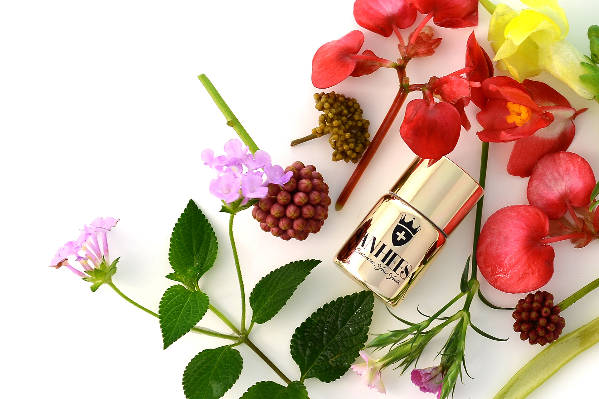
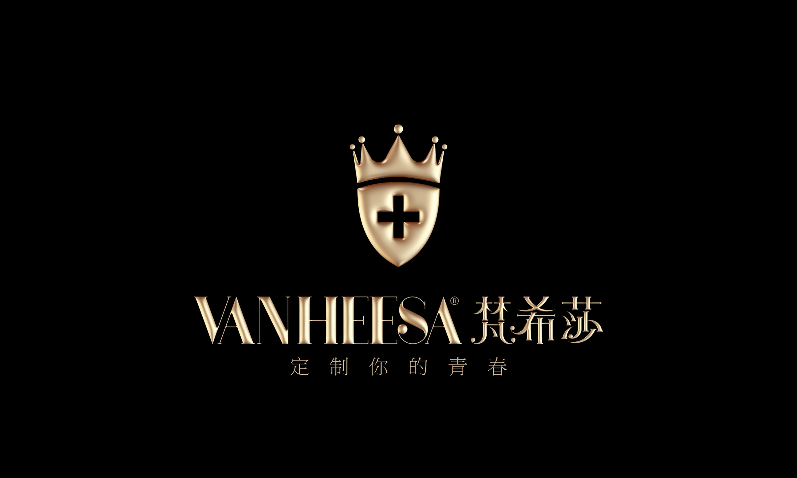
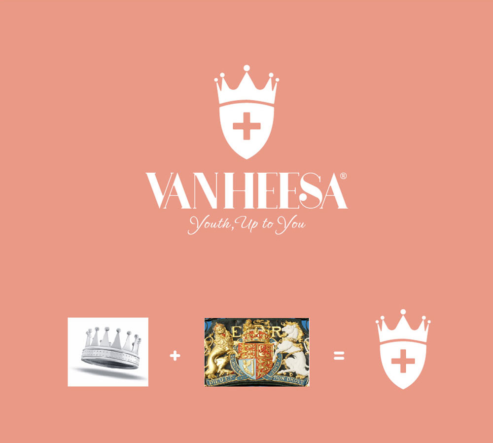
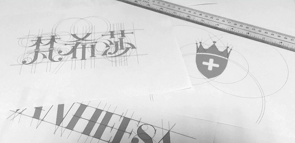
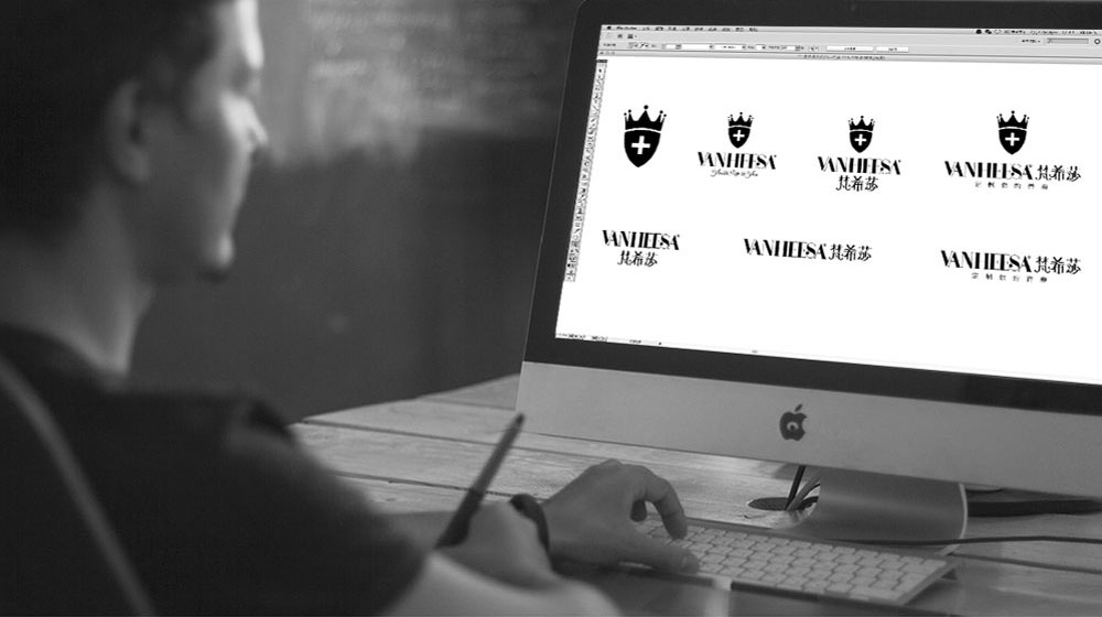
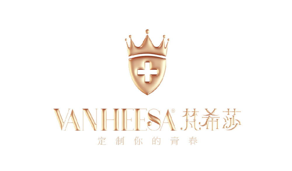
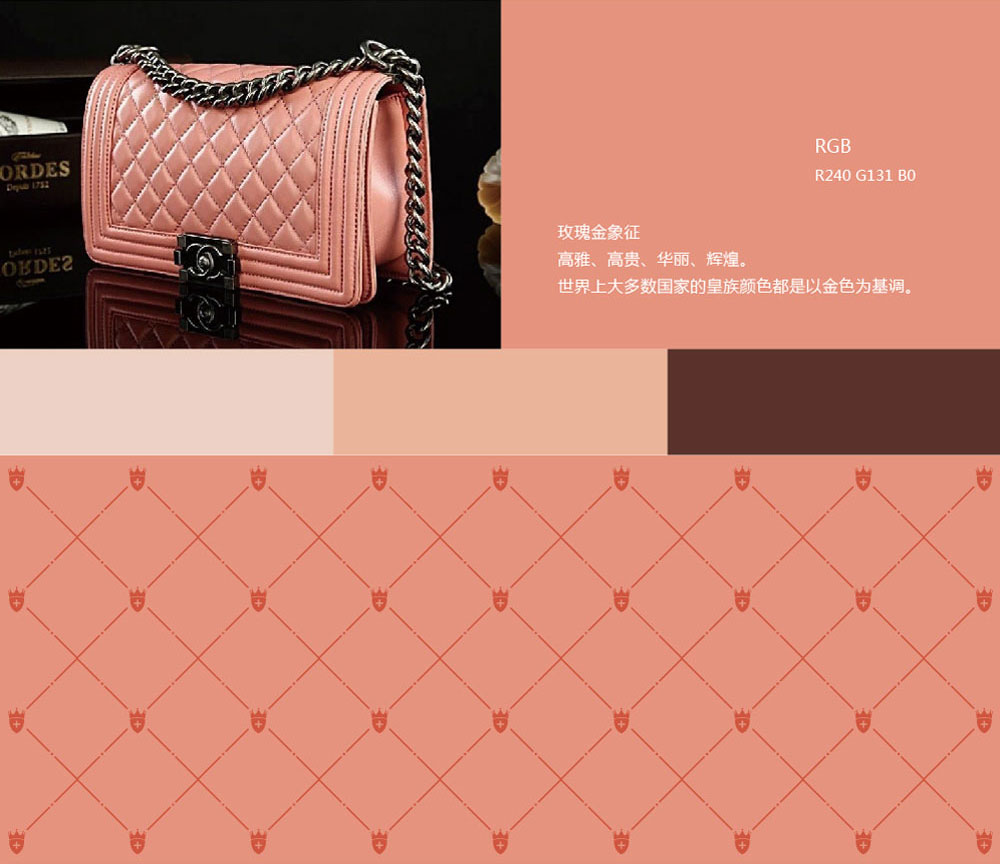
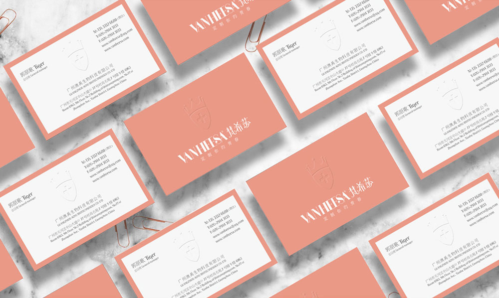
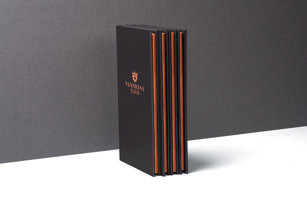
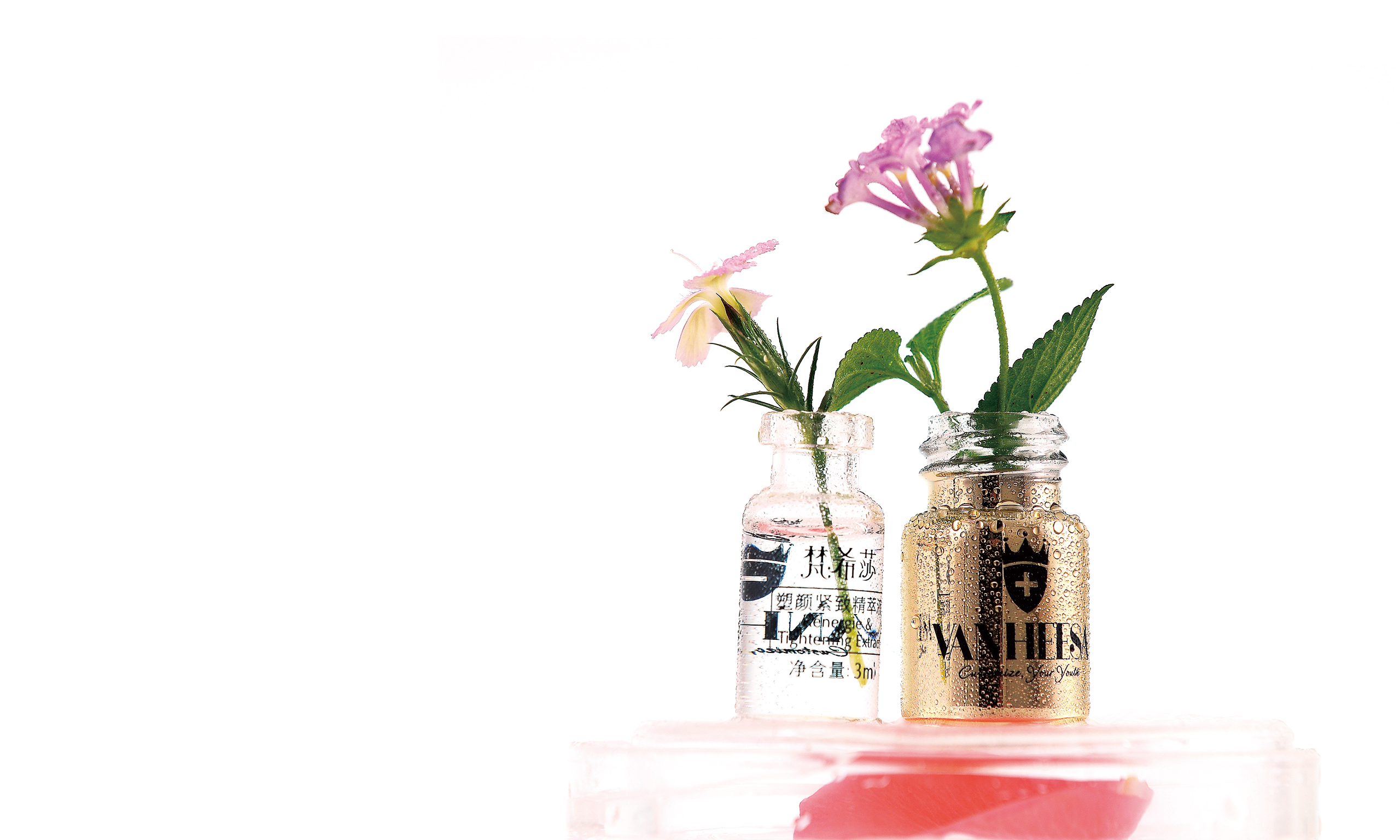
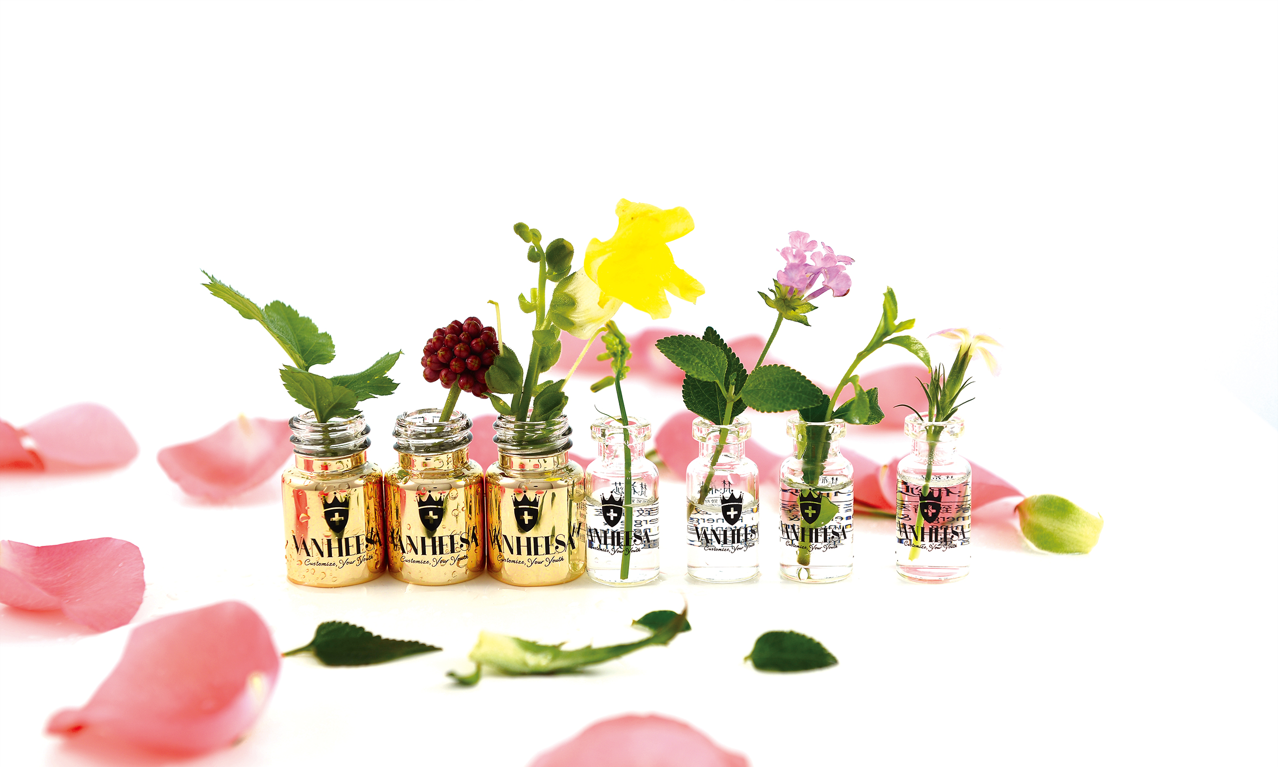
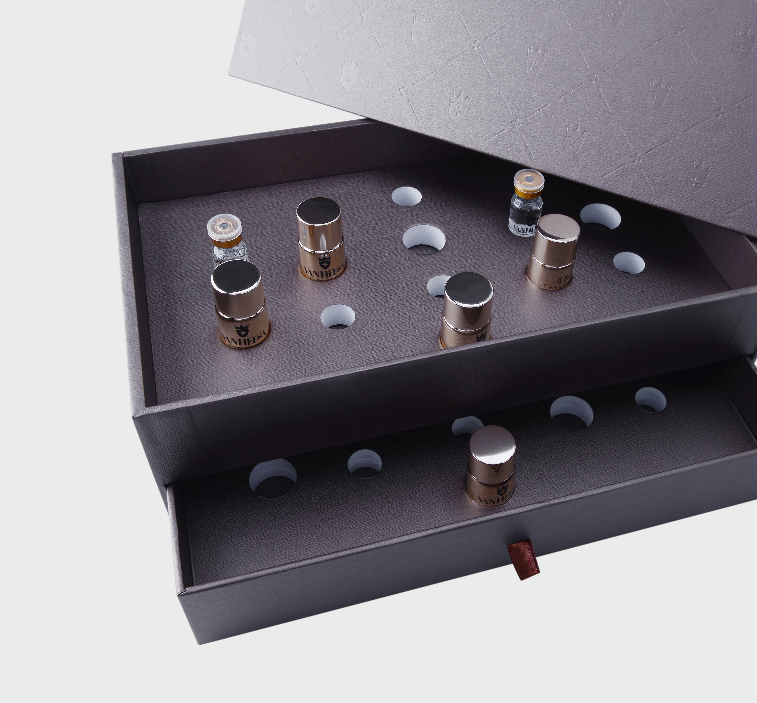
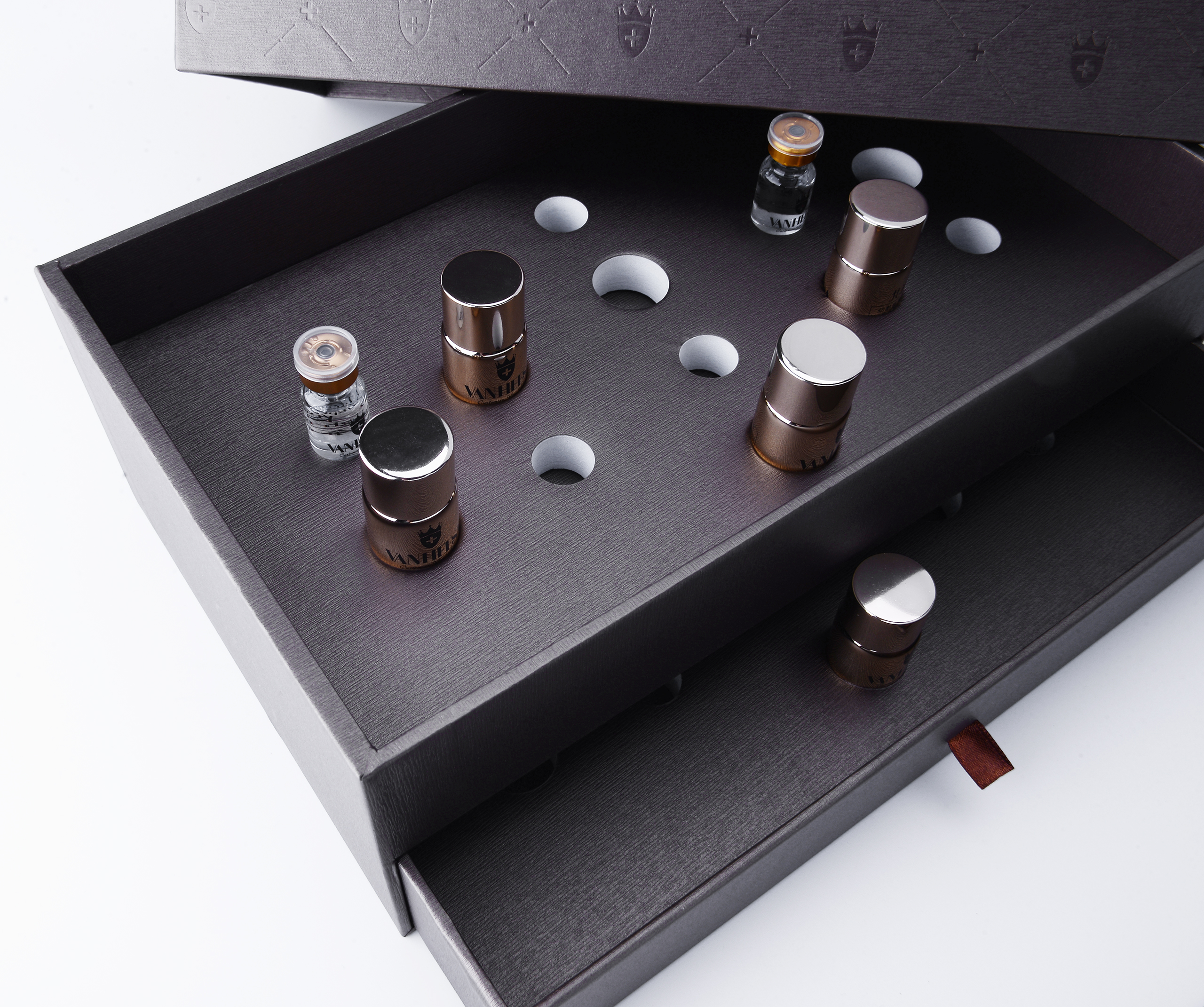
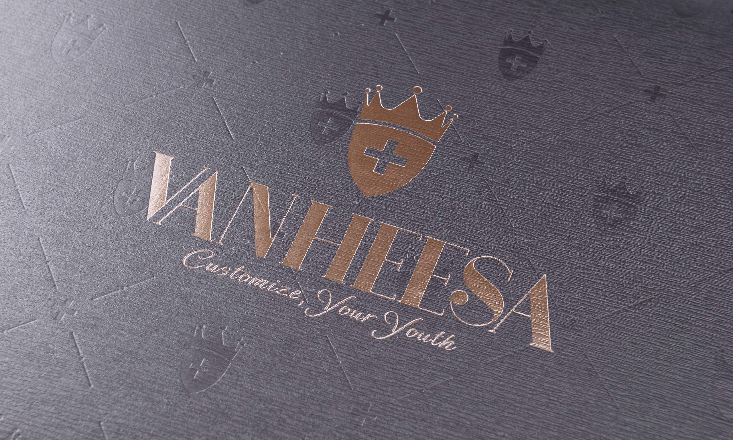
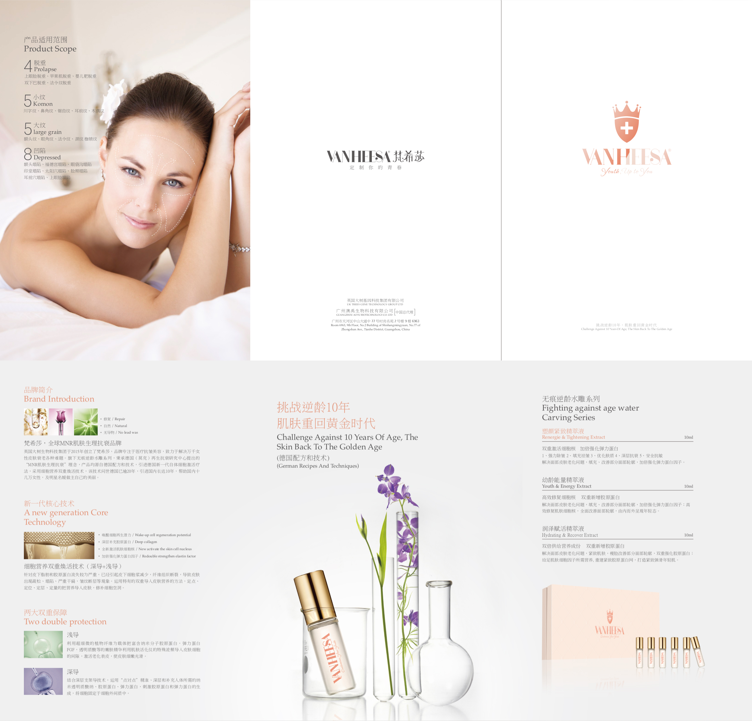
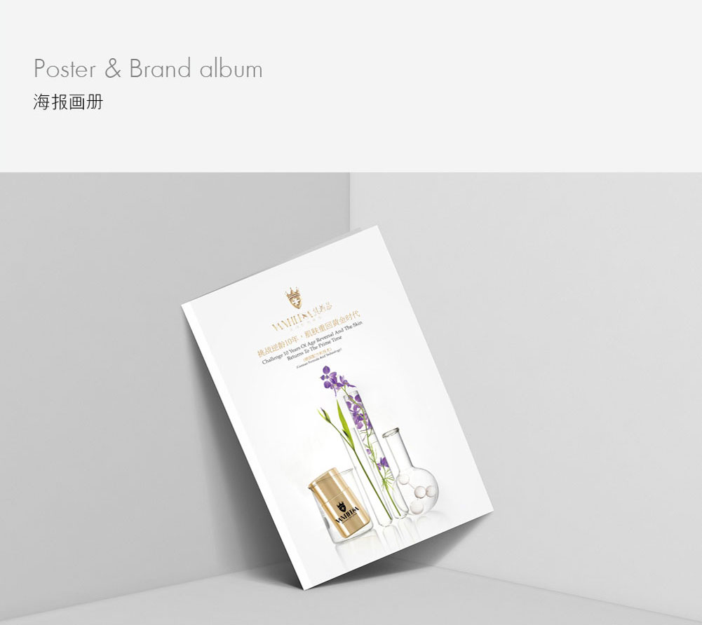
Insights show that the target consumer group pursues high-end style, believes that their skin condition between 20 and 30 years old is the golden age of their skin, and regrets that they only care about their careers and do not take good care of their skin. The new generation of German therapies introduced by Vanshisha can effectively improve skin aging problems and revitalize beauty. Therefore, the team uses "customize your youth" as the brand positioning of Vanshisha, and is committed to helping more female consumers to be the masters of their own beauty. In the design of the brand logo, the team put the "cross" representing medicine and professionalism in the shield, which not only implies the brand's British origin, but also implies Vanshisha's professionalism of "resisting aging and protecting young skin"; and the crown representing the British royal family can add authority and luxury to the brand. In terms of product packaging design, the team considered and finally chose the luxurious gold as the main color of the product packaging; the outer packaging box chose dark brown and elegant gold that meet the visual orientation of the target consumer group, and carried out convex and hot stamping details inside the box to increase the noble and elegant texture; in addition, the team designed the product combination box to be pull-out type to facilitate users to use the product better.
Purpose and Results:
After repositioning and upgrading its image, Vanshisa's popularity and influence have been greatly improved, and it has received good feedback from many consumers and wide acclaim from industry insiders.

© All rights reserved. BLUE Benlai Design Co., Ltd. XML ICP13085632