Category:Cosmetics
Material:Paper-Metal-PE Plastic-Glass-Matte Acrylic-Cloth
Client:Guangzhou Jiebao Cosmetics
Material:Paper-Metal-PE Plastic-Glass-Matte Acrylic-Cloth
Client:Guangzhou Jiebao Cosmetics
Project background:
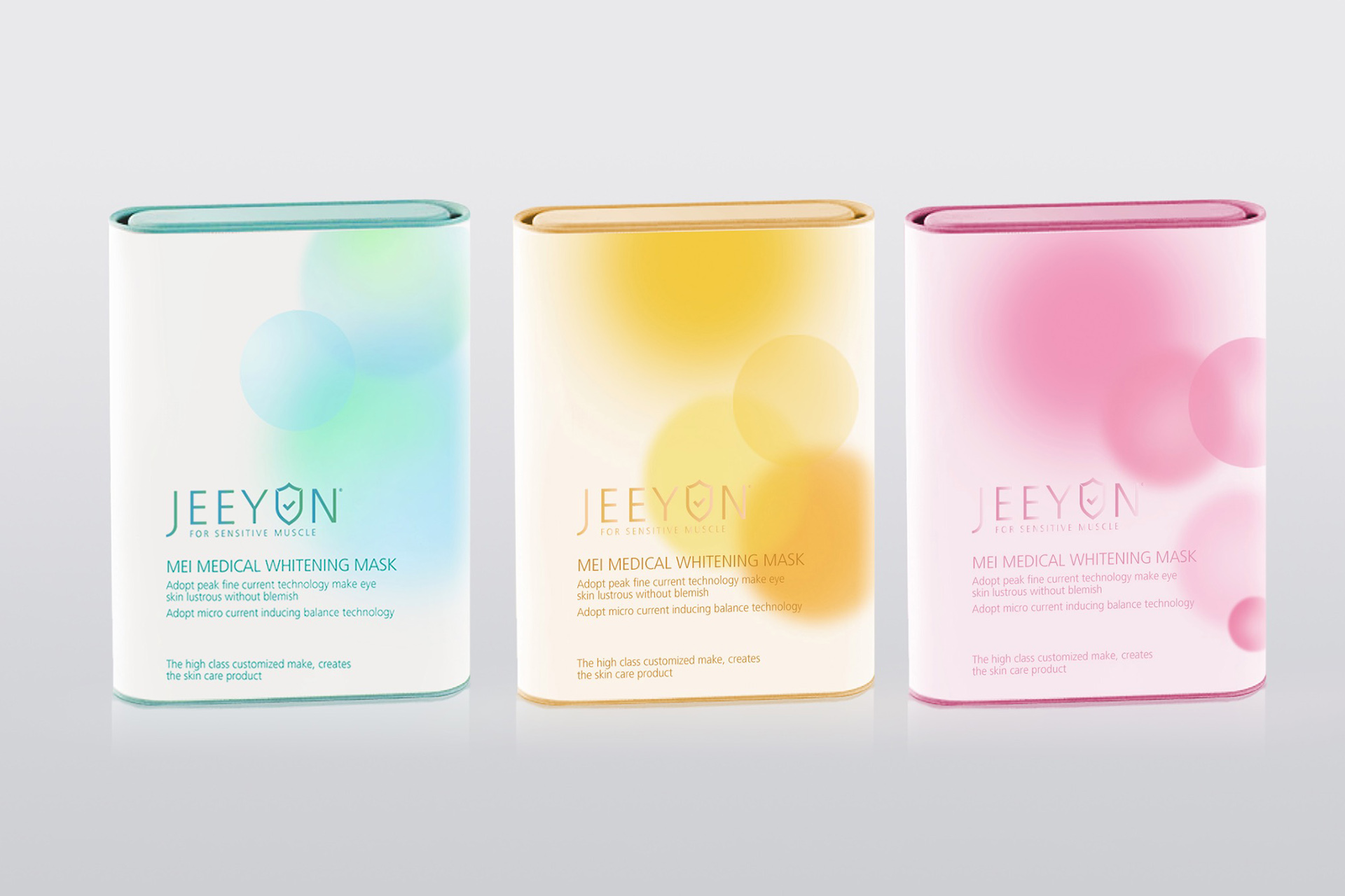
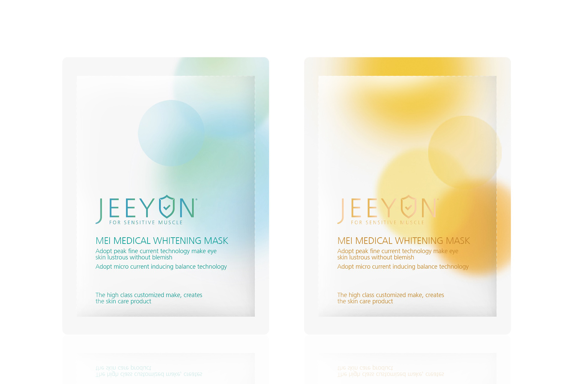
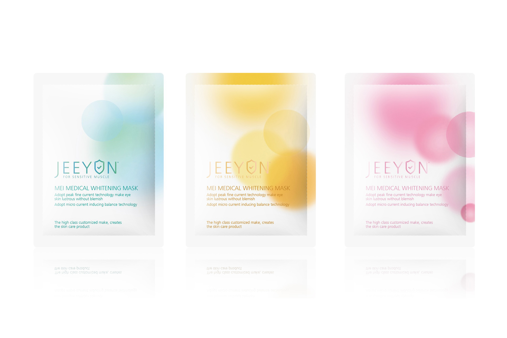
For many girls, applying a facial mask is an essential part of skin care. As an emerging cosmeceutical mask brand, Jirun, how to improve brand awareness and quality through precise brand positioning and product packaging, help the brand quickly rise to the top and achieve sales growth, is the biggest challenge encountered in this cooperation.
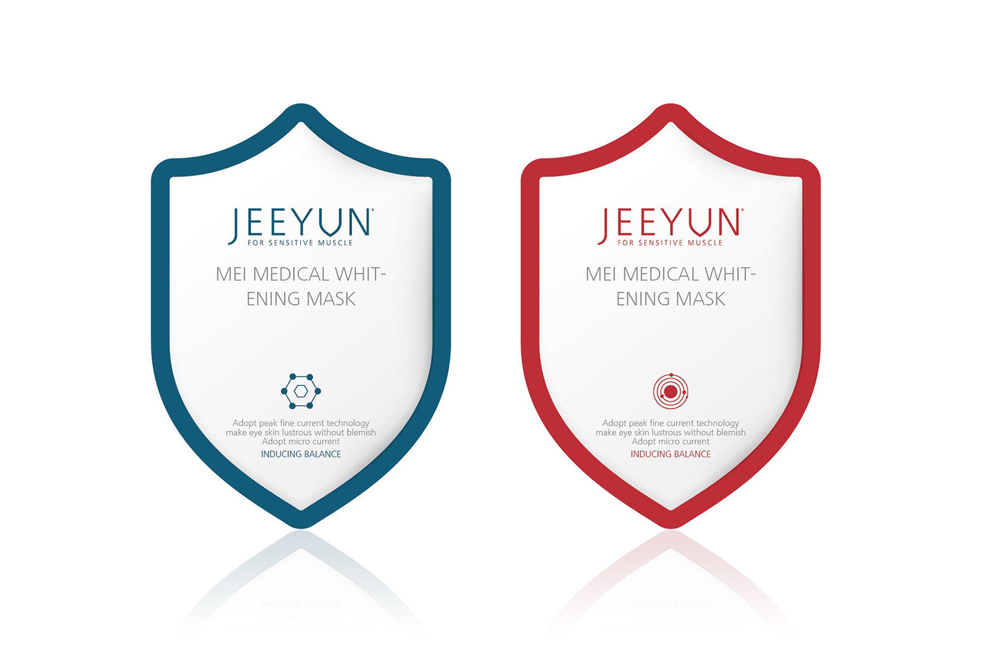
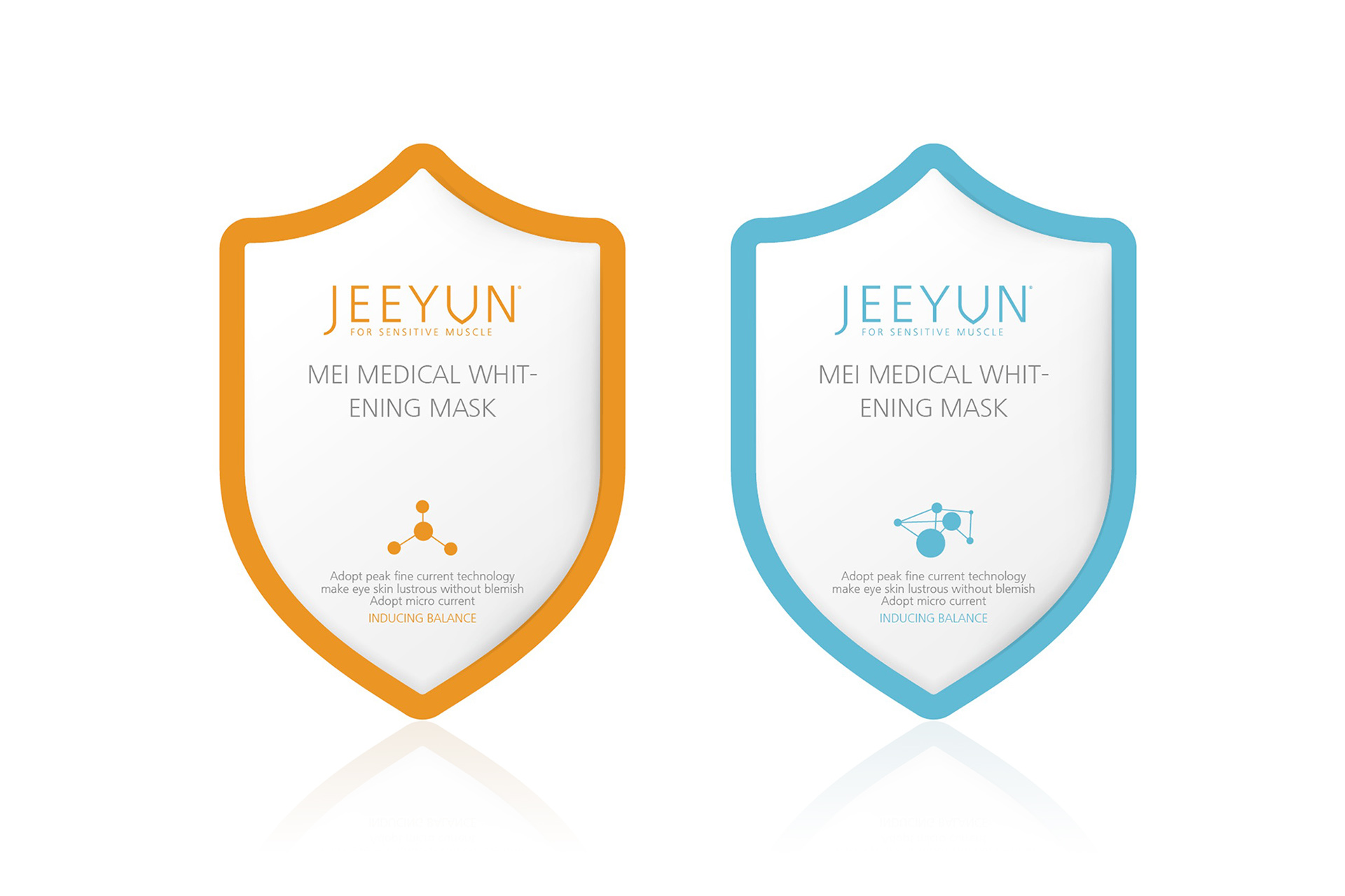
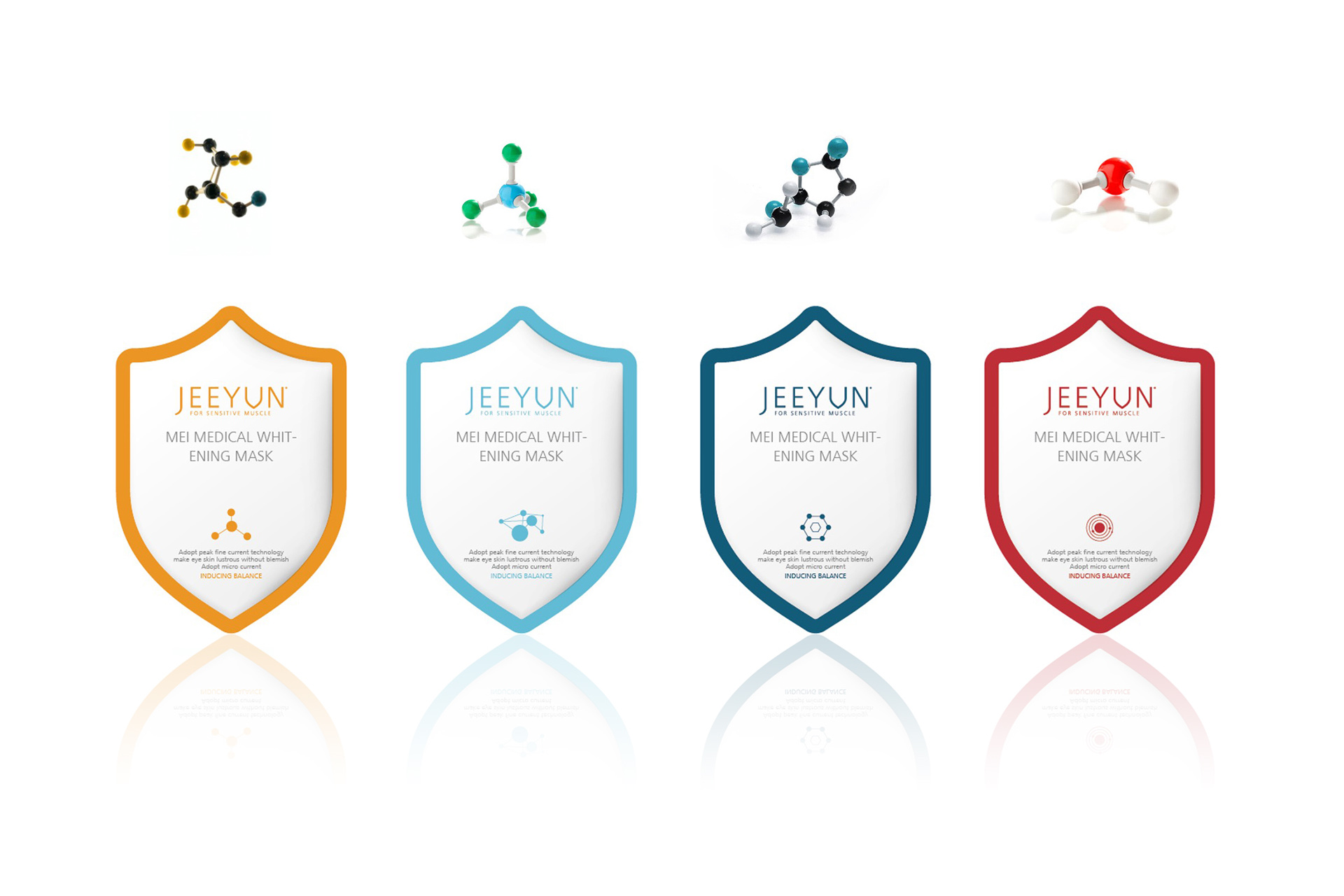
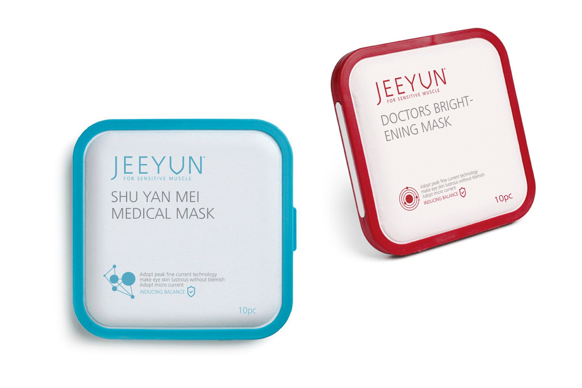
Solution:
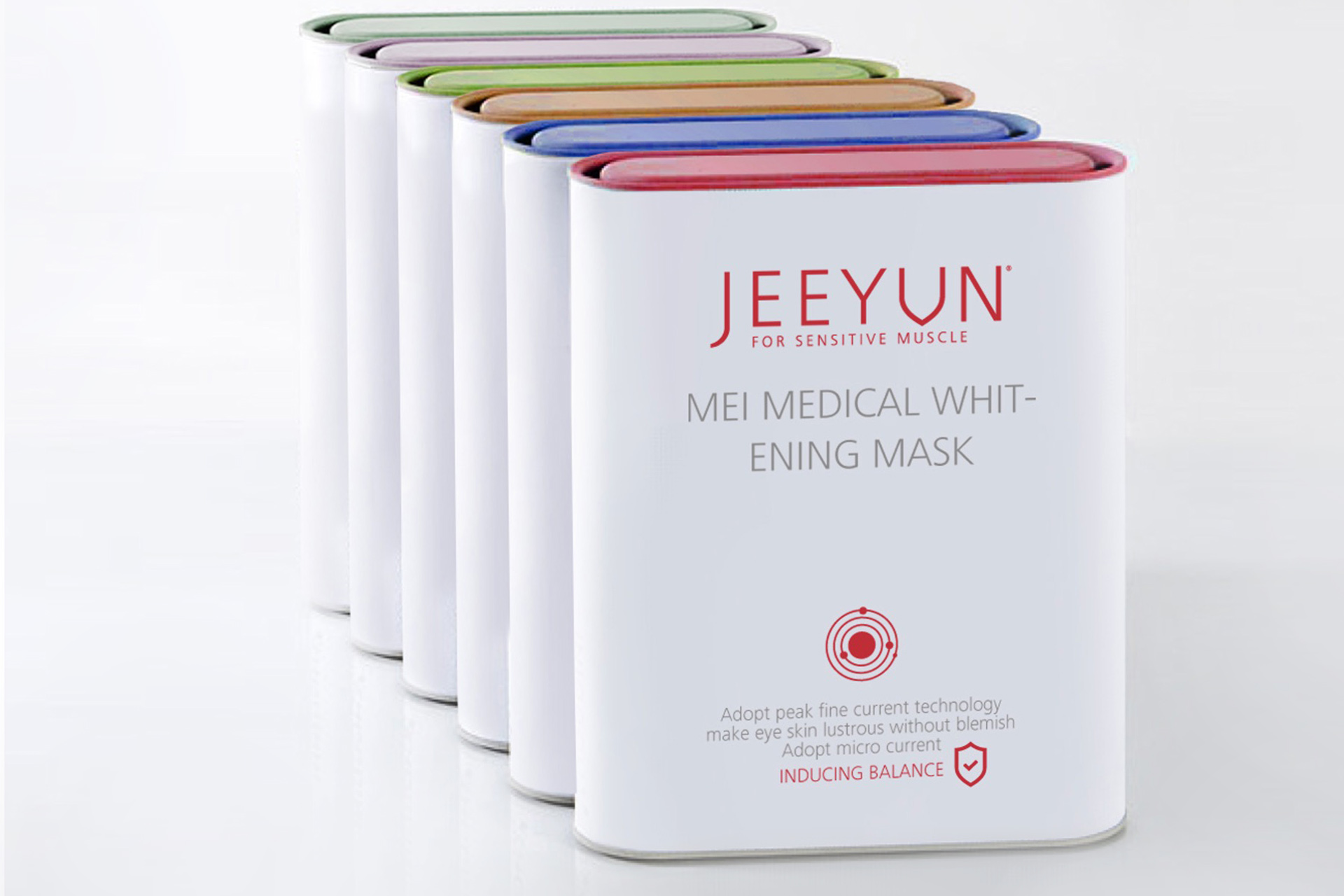
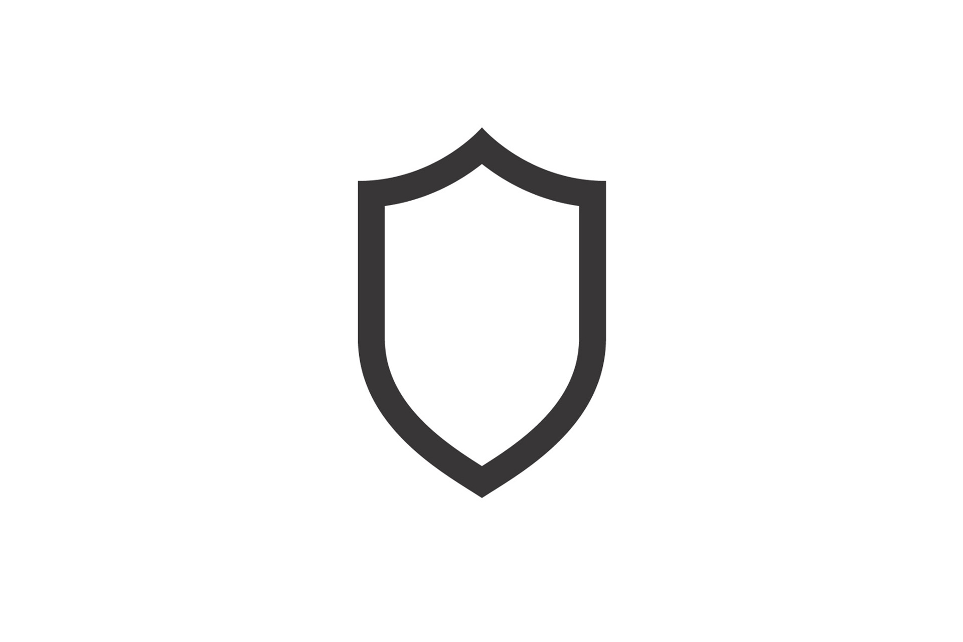
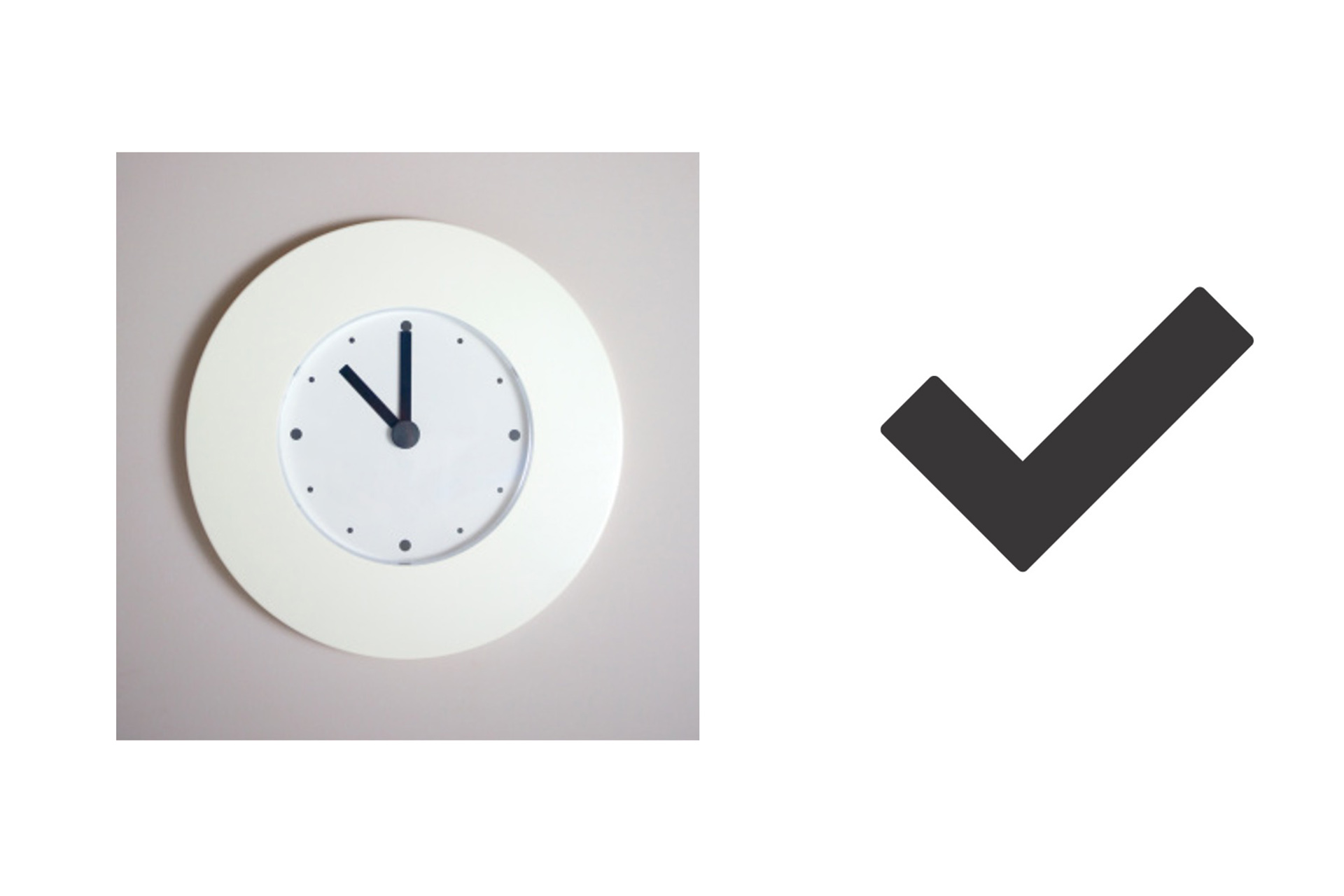
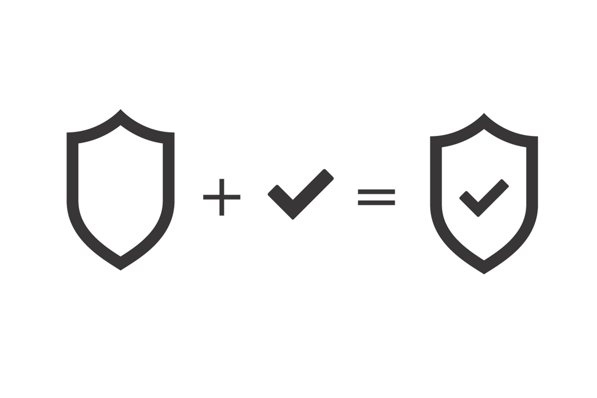
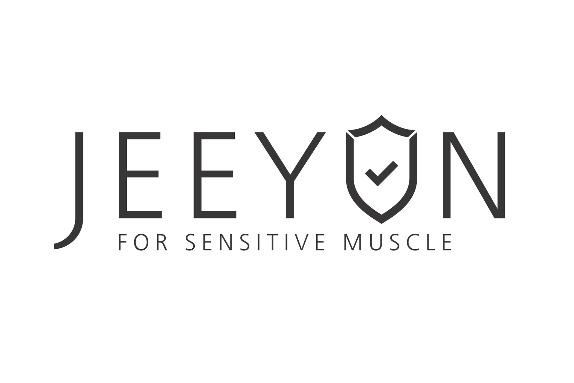
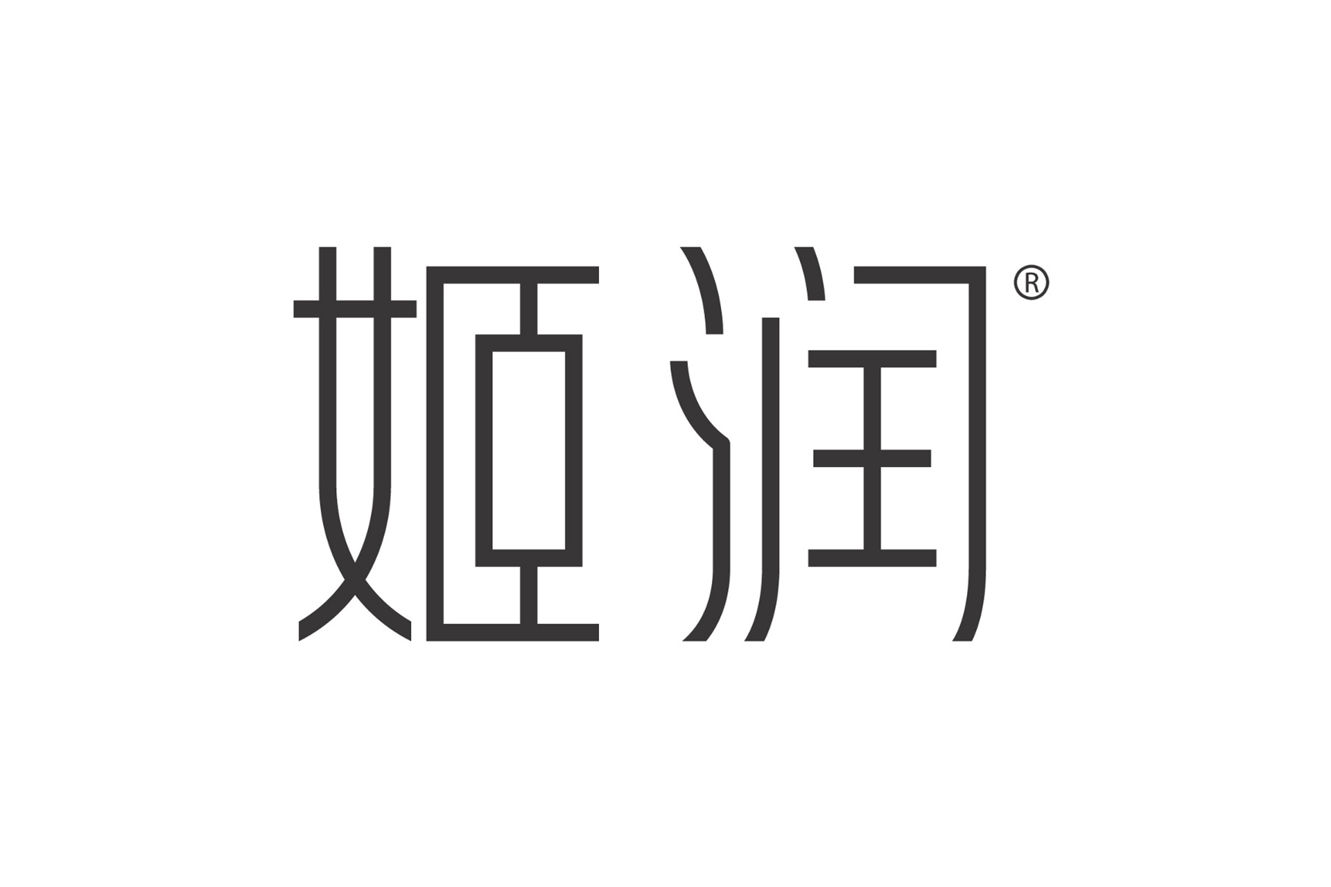
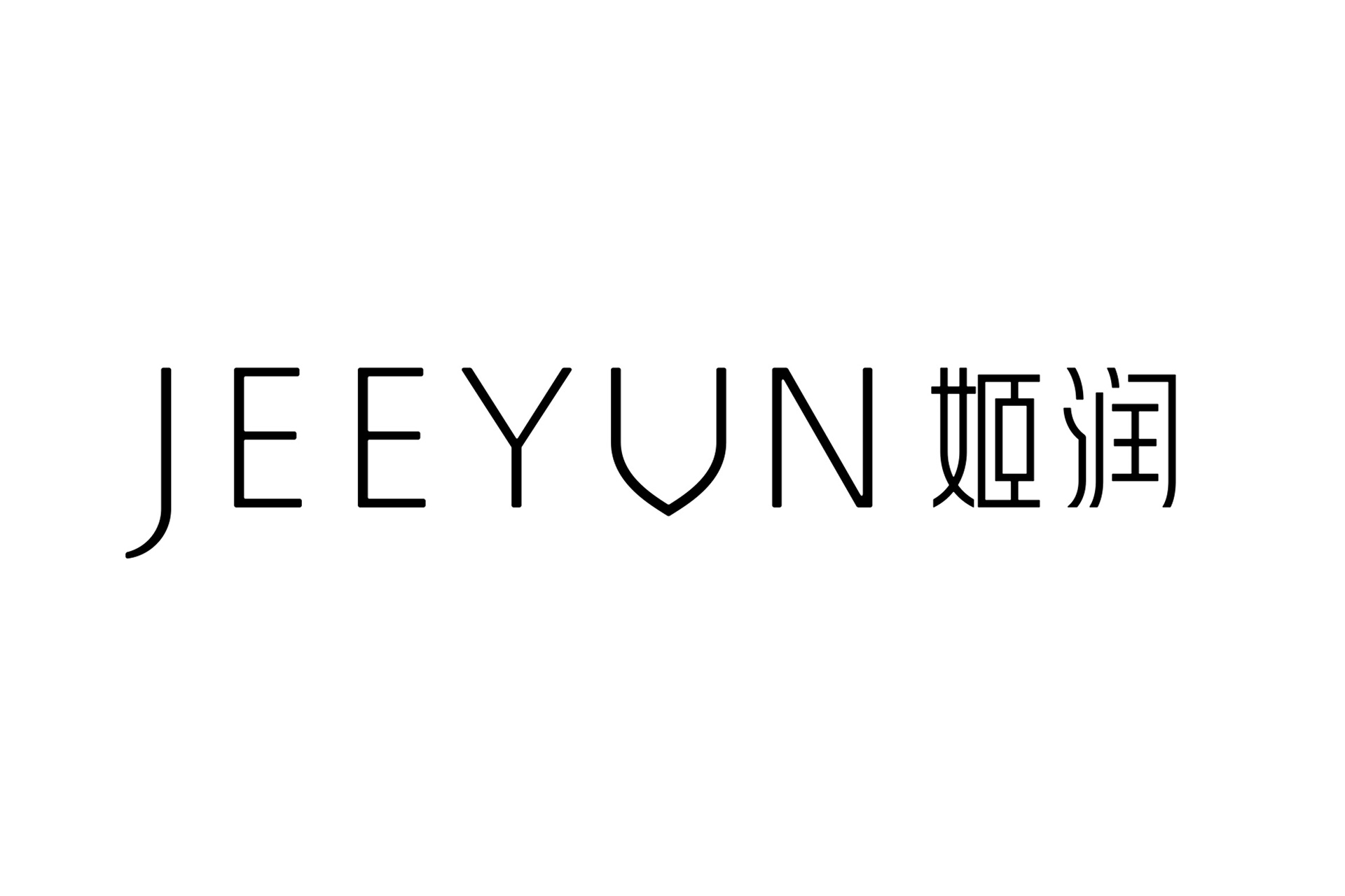
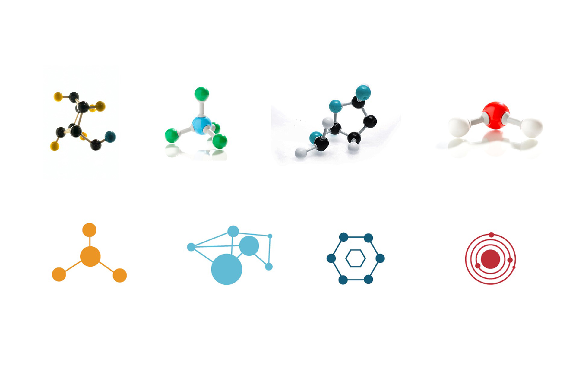
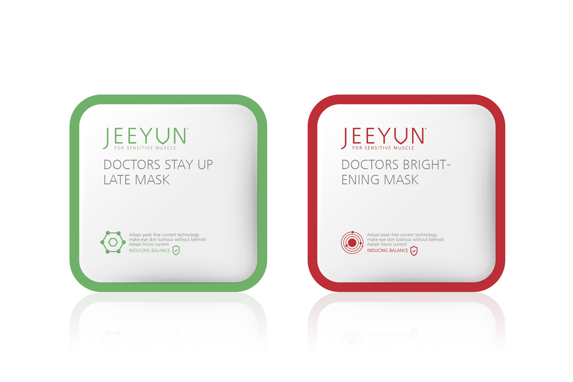
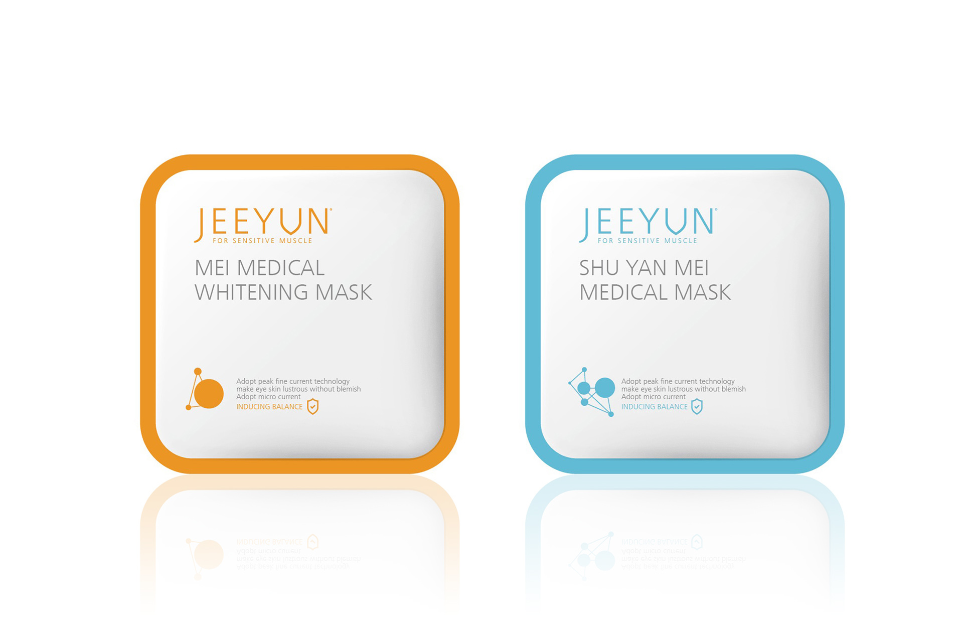
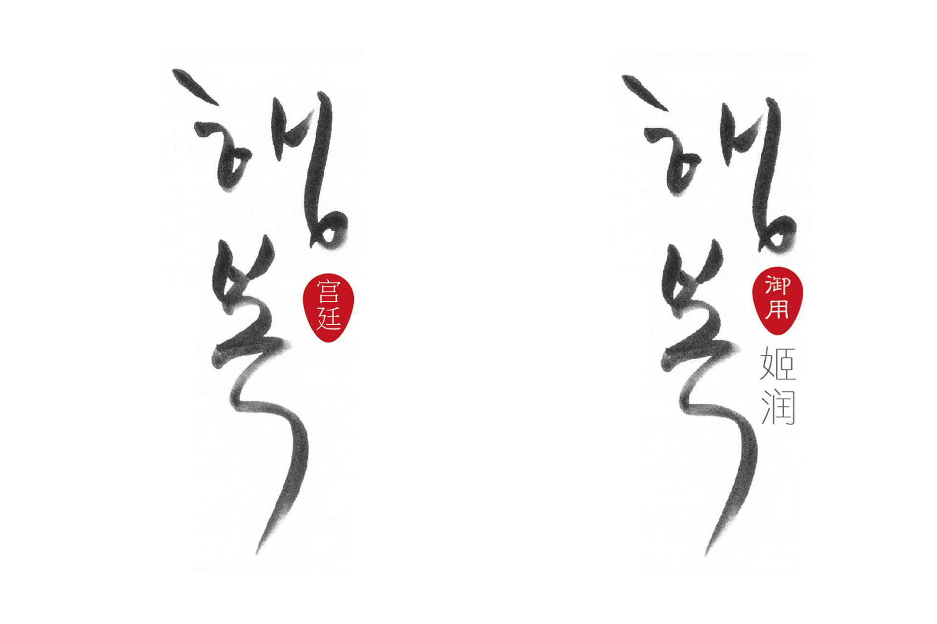
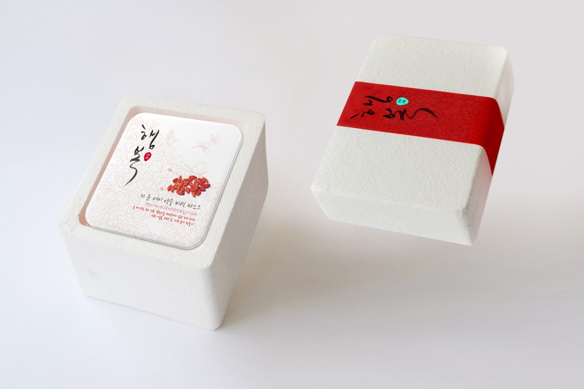
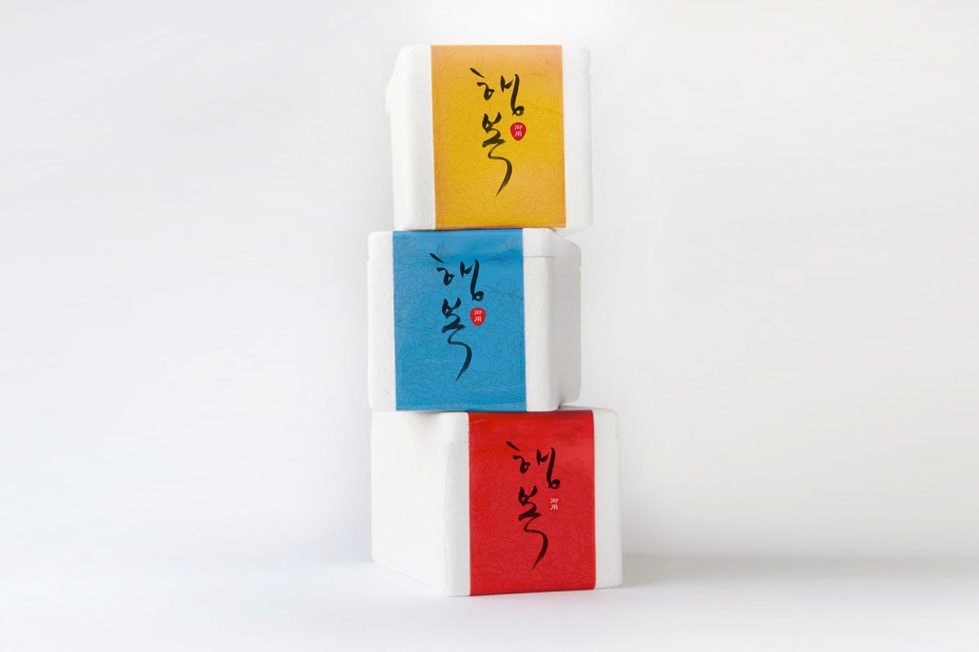
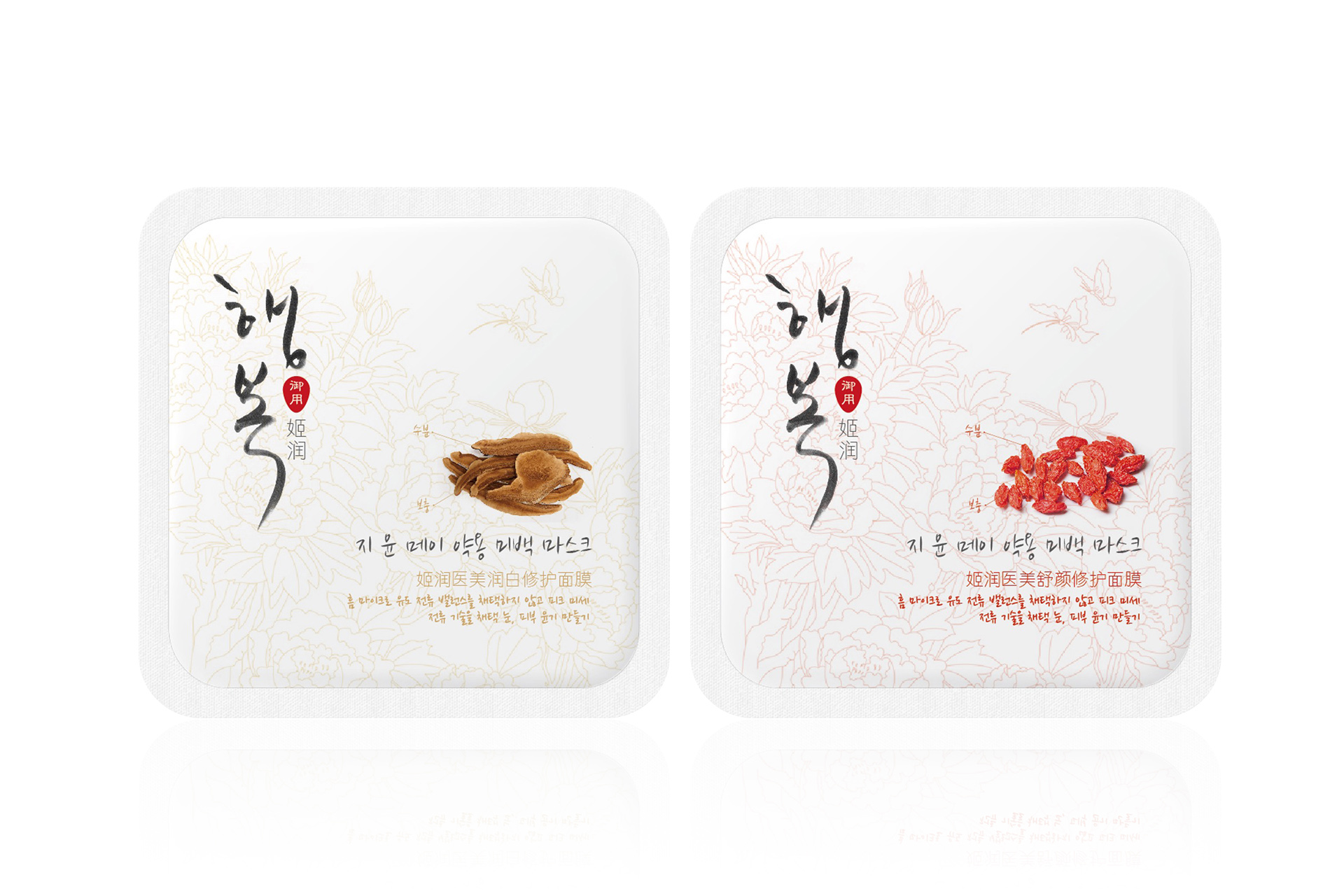
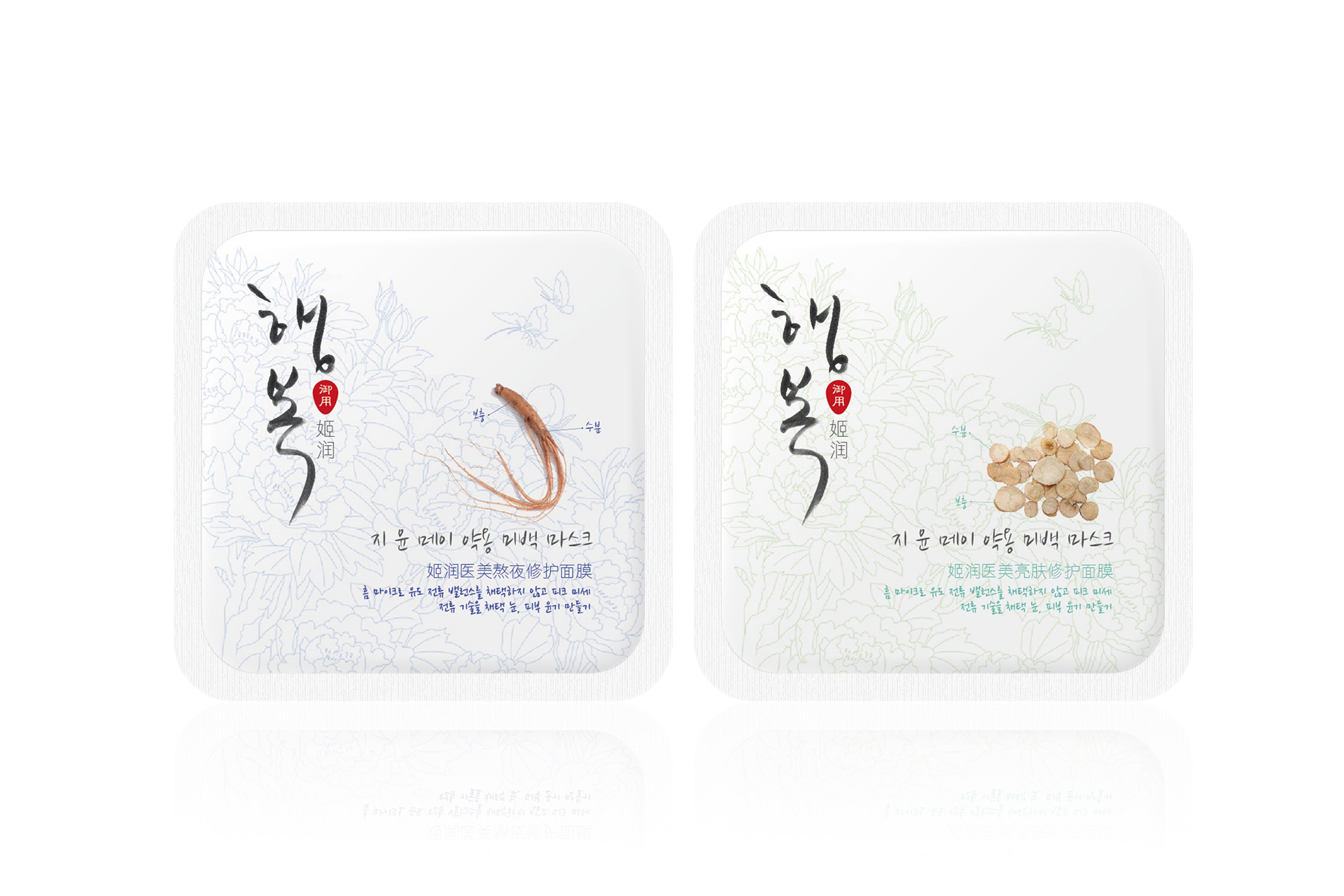
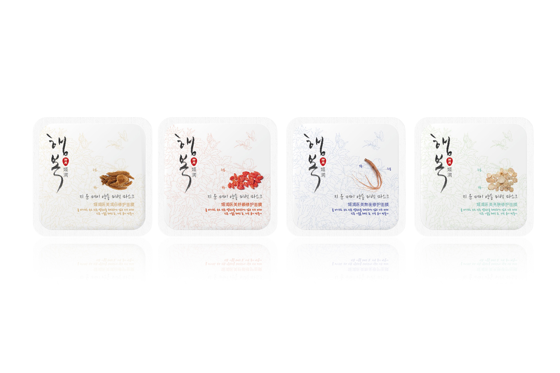
In the English name of the brand, the team borrowed the practices of international big brands and used the phonetic notation "JEEYUN" as the English name of the brand to strengthen the association between the brand in Chinese, English and Korean, and let consumers focus on the meaning of the brand in Chinese. In the logo design, the team used the shield and the hour and minute hands on the clock as the main elements, implying "Jirun, your beauty guard", "easy care, pampering beauty", "cosmeceutical mask that properly cares for the skin", etc. In the product packaging design, molecular elements with medical characteristics are used in the packaging design, and a variety of vibrant and comfortable colors are selected to make the design more aesthetic and feminine.
Purpose and results:
We hope to provide users with a skin care journey through this design, allowing them to feel the perfect fusion of nature and technology while taking care of their skin. We hope to highlight the characteristics of the Jirun cosmeceutical brand and let consumers feel the brand's unique skin care concept when choosing products.

© All rights reserved. BLUE Benlai Design Co., Ltd. XML ICP13085632